


Humans are visual creatures, so visual, that colors can play a vital role in influencing our purchasing decisions.
In fact, in a study done by performable, where they tested which color button between green and red would have the highest conversion rate. They found that red buttons increased their conversion rate by 21%.
In other words, they increased their conversion rate without changing anything about the page except for the color of the button.
That’s the power of marketing color psychology.
It’s true. The use of color affects human behavior. A simple change in color can drastically change the process of our decision making causing us to take different actions.
But why is this? What is it about certain colors and the impact of color that spark people to take more action?
And how do you know the right colors to use, so you can improve your digital marketing strategy?
To answer these questions we have to first understand the basics of the psychology of color.
Why?
The truth is, your favorite colors may not be the best choice of colors to use when it comes to designing your logo and branding.
That’s because the perceptions you have with your favorite color may not be the same as the ones your audience has.
This is often overlooked by many businesses trying to choose colors to represent their brand personality.
It’s hard to ignore that we all have our personal preferences. We all have our favorite color.
So oftentimes what happens is, we make color choices based on colors that we like or that we think to look good instead of trying to pick colors that most align with our goals.
That’s why the mission of this blog is to help people put aside their personal preferences and color preferences and look at marketing color psychology differently.
Understanding the psychology of color will help you recognize the perceptions around specific colors and how different color combinations can do wonders for your marketing overall.
When you understand the impact of color your strategy will be even more effective.
In this blog, we’ll look at some primary colors, talk about their different meanings, and discuss how some brands are using them.
We’ll also give you a simple plan to follow if you want to learn how you can take advantage of colors in your marketing and build a powerful color scheme for your brand.
Okay, let’s go ahead and dive in with the basics of color psychology.
Takeaways
- Your favorite colors may not be the best choice of colors to use when it comes to designing your logo and branding.
- When color psychology is used in marketing, different colors can impact the way audiences perceive a brand in ways that aren’t always apparent.
- Paring certain colors together can give a different connotation than the colors on their own.
What Is Color Psychology In Marketing?
Color psychology is an area of research that looks at how colors influence human behavior.
And when used in marketing, for example, different colors can impact the way audiences perceive a brand in ways that aren’t always apparent.
That means just because it’s your favorite color, doesn’t mean that it fits your brand.
 Even if it’s a super popular color, it also doesn’t mean that it will produce better results.
Because with every color there are going to be positives and negatives.
Each color truly has its own color perception and you need to be aware of both the positive and negative color associations that revolve around different colors.
You should also know that colors are just a portion of your brand’s experience.
There are a lot of other factors in play like your fonts, your design style, your products, and even your people.
Each of these elements works together to influence the effectiveness of your brand image.
And we could talk all day about those factors but for now, we’re just going to focus on colors.
Now let us go ahead and look at 10 different colors to understand color psychology and the effect they can have on people.
Color Psychology: 10 Different Colors’ Psychological Meaning

1. Blue
We love this color because the color blue has some really strong effects on your mind.
Some of the positive associations with blue are that it can have a very calming effect.
Cool colors in general tend to have a more calming impact on people and are great for giving off a relaxed, serene, or “trusting” effect.
Just think about staring out at a nice blue ocean and seeing the calming waves and enjoying the serenity.

Blue is also associated with wisdom, strength, and trust.
The color blue is a primary color and can be seen in many variations for plenty of entities across the world.
That’s why primary colors like red, yellow, and blue are used in nearly every country flag in the world.
In addition, companies like Facebook and Twitter use the color blue in their logos to signify unity and connections to others around the globe.
Blue is used to convey that their platforms are trustworthy places to engage with your friends.
Now we did say there were negatives to each color.
The negatives of a dark tone such as blue, are that it can be associated with coldness and a lack of emotion.
Of course, oftentimes the credit companies like Paypal, American Express, and Visa who really want to win you over with trust, often use blue.
Let’s move on to another great color and number two on the list, Red.
2. Red
Now red is a powerful color which has some great positives. For one, it can spark strong emotions both negative and positive.
It is oftentimes seen as a powerful color that represents leadership.
Since the color red is associated with power and passion, it can increase levels of urgency and excitement.
This is why you often see red associated with fast cars and lingerie.

It helps to draw attention because of how well it stands out. This helps prompt action by how stimulating it is.
Netflix is a company that uses the color red to display this level of excitement and passion that you can experience while enjoying their app.
Coca-Cola and Target are also other companies that use red in their logos and branding.
Using the color red helps portray a culture of excitement, leadership, and innovation in both brands.
On the other hand, very dark tones of red can give off negative levels of energy like anger or danger.
However, warm colors like red are great for creating any type of boldness and excitement in your content.
That brings us to another warm color. Number three on the list, yellow.
3. Yellow
The color yellow is more commonly associated with being bright, right? And when you think of bright colors you probably think of yellow first.
But when you use the color yellow appropriately, it can have a profound effect.
The color yellow can evoke feelings of optimism, intellect, and positivity for your brand.
Other positives of yellow are that it is associated with sunshine, happiness, and fun.
So if you’re brand experience incorporates some of these things, then a splash of yellow will definitely help.
Usually, when you see anything in yellow it stands out the most. The color yellow really does draw attention and can be a very useful color choice for your branding if used properly.
On the other hand, the negatives are that yellow is often associated with cheapness. People typically expect to see good deals when they see the color yellow.
For example, one of the most notably known brands that use yellow is McDonald’s.
And of course, they associate their brand with cheapness, happiness, and fun.
This is another great job of a brand harnessing the power of yellow.
However, the negatives of dark tones of yellow are they can portray emotions of fear or anxiety.
So it’s best to recognize what shade of yellow you can use if you want to use the color yellow in your marketing.
The next color on the list is orange.
4. Orange
One of the big positives of the color orange is that it often is associated with the sun and the fall, which gives off a feeling of warmth.

The color orange is actually in the warm color category of the color wheel, so it’s no surprise that it can give off these vibes.
In some cases, orange is sometimes seen as a “friendlier” version of the color red.
Oftentimes, it helps create a sense of haste or movement, which is great for content where you want to encourage your audience to take action.
Additionally, orange is a color that most people consider to be cheap. Similar to yellow, but a little different.
Do you know when you think about really HIGH-END EXPENSIVE ITEMS? Yeah, you normally don’t think of the color orange do you?
On the flip side, a really dark tone of orange can be associated with frustration and immaturity.
Can you think of one of the biggest companies in the world that use the color orange in a positive connotation?
If you said Amazon, then you’re right!
When you think of Amazon, you probably associate it with really good customer service (which is the warmth & friendliness positives of orange)
And they are known for having the best deals out there which they use to their advantage by associating their brand with being cheap.
With orange, you can also portray spontaneity.
Brands like Nickelodeon and Fanta use the color orange to help them portray a lively and youthful culture for their brand.
With the color orange, you can have a good balance between red and yellow that isn’t overpowering but also helps your branding remain energetic.
Let’s move on to color number five on the list which is Green.
5. Green
Now green is a relaxing color that is easy on the eyes.
It can be used to represent serenity, quality, and peacefulness to your audience depending on what industry your business is in.
Most times when you think of the color green, you may think of nature.
And some of the positive associations with green are it’s synonymous with health, freshness, and growth.
For example, if you were a company that specialized in outdoor goods like gardening tools and appliances.
Then, the color green could help to give off a serene effect that portrays your brand as responsible and stable.

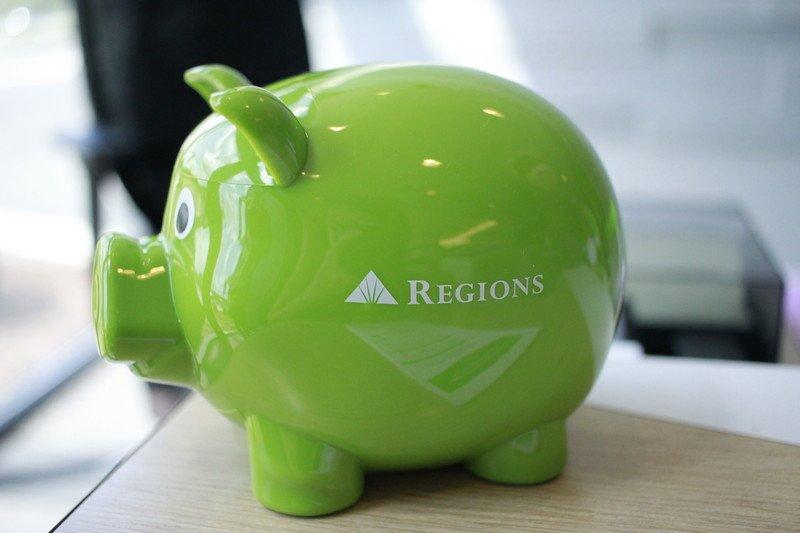
However, other times you may think of the color green you may think of money.
Like we said before, the way you perceive colors is based on your personal preferences. But the actual business industry has a lot to do with it as well.
So if you’re in the business of money like finances, accounting, or banking then green could be a good choice as well.
Now there are not a lot of negative connotations associated with green, especially dark tones.
However, one negative factor that can be associated with the color green is boredom.
But despite that, there are many brands that leverage the color green as a positive one.
One of the most popular brands that leverage the positives of green is Whole Foods.
They focus on really healthy and natural foods which correlate really well with green.
Whole Foods use the color green in their logos to help portray those certain characteristics about their brand.
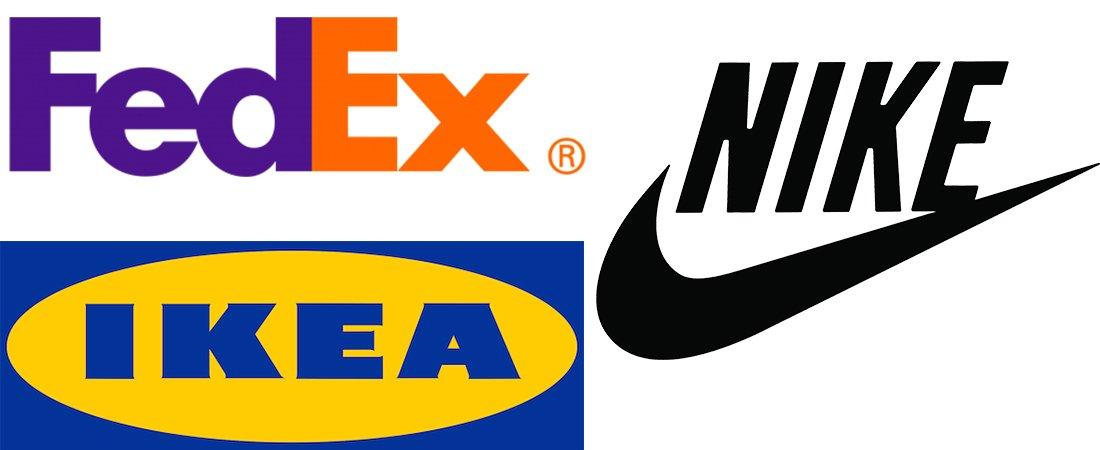
6. Black
Now black isn’t usually considered a color but more so a shade. Nonetheless, they do still evoke certain emotions when used in branding.
Black is a powerful color that has a positive association with luxury, sophistication, substance, elegance, and formality.
Think of a black-tie event or a premium ride on Uber. Black has an exclusive feeling associated with it.
Black can be a great color choice to use if you want your branding to evoke elegance and classic style.
For example, if your business is in luxury goods, then using the color black in your branding can help portray your brand as high quality to your audience.
In addition, the color black can sometimes represent class and timelessness.
That’s why it’s no surprise that some of the world’s largest companies have black logos.
Nike, Adidas, Disney, and even Apple have black logos and these companies have stood the test of time.
Depending on your brand, those are all great characteristics to have, but there are some negative associations with the color black.
For instance, black is such a commonly used color, it makes it very easy to use black as an accent color.
Notice how we said “accent color.”
Black is one of the hardest colors to execute properly because you normally need other psychological influences as well.
And when you fail at using it properly then the negatives are really bad. It can be associated with coldness, evil, oppression, and even death.
That’s why using the color black in combination with other colors helps to change the perception people may have of your brand.
Ultimately, we strongly advise you to avoid any negative associations with the color black because of how extreme these negative connotations can be.
The next color on the list, color number seven is White.
7. White
The color white is pretty similar to the color black in the sense that it represents simplicity and elegance but in a more subtle way.
And just like the color black, white can be extremely powerful, yet difficult to execute.
White is often associated with being modern, sleek, and clean.
Companies like The North Face and Cotton use the color white in their logos to represent an easy, fresh, and clean quality about their brands.
As do brands like Apple and Tesla, who take advantage of white because of their ability to demonstrate these things with their entire brand experience.
However, if poorly executed white can look very lazy, plain, and lack personality.
The color white also has some of the same characteristics as cool colors like blue and green.
This means, sometimes it can portray a calm, relaxed, or neutral tone depending on the content.
White is also a good choice to use for text because it stands out like the color yellow but in a more understated manner.
It has the ability to generate brand recognition by attracting your audience, but it doesn’t portray that “cheap” color meaning that we talked about the color yellow having earlier.
8. Purple
The color purple can be seen as soothing but also regal, luxurious, and creative.
If your brand is looking to portray an imaginative culture, then purple is a great color to use in your branding.
This is because typically the color purple is seen to be mysterious and associated with new ideas.
Companies such as Yahoo and SyFy use the color purple because it portrays an imaginative, creative, mystical, and ambitious culture to their brand.
Purple also is a mix of red and blue. This means it has qualities that help create stimulation, imagination, serenity, and trust because it’s a good balance of both colors.
However, the color purple can be negatively associated with moodiness as well.
9. Pink
The color pink is a variant of red which makes it a warm color. Since pink is in the same family as red, it does give off some of the same traits as red.
For instance, red can give off love as well as respect and so can the color pink.
The color pink is, however, more commonly presented as a feminine color.
It is used in many feminine logos and branding and traditionally has been associated with femininity.
Victoria’s Secret and Barbie are two major brands that use pink in their branding. This works well for them because their brands are geared towards girls and women.
That being said, if your brand audience is more feminine or you want your brand to portray a feminine image, the color pink would be a good color to use.
However, the color pink can be perceived as weak. But based on your brand’s bottom line, the color pink could really make sense for you to use.
10. Brown
You may think of chocolate when you think of brown (and we don’t blame you) or you may think of something else based on your experience.
However, in many instances, the color brown tends to represent a rugged, earthy, or outdoor image.
The color brown can be seen as having similar characteristics to the color green because of the nature influence in representation it has.
But the outdoors is just one perception the color brown has. It is also portrayed as dependable, reliable, and friendly.
All characteristics you might associate with one company that uses big brown trucks.
That’s right, UPS.
This is why UPS is so recognizable. Their big brown-colored trucks help their logistics company become recognizable and associated with dependability.
In turn, this helps influence and strengthen their overall brand image.
Brown can sometimes be seen as conservative or dogmatic in some negative contexts.
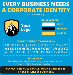
Importance Of A Color Palette
So we’ve looked at the general perception of the most used colors and what they mean individually.
But what if you want a whole color scheme instead of just one brand color?
Frankly, having a color palette is one of the best options if you want your brand to stand out and portray different elements.
Because truthfully, most brands today have deeper stories behind them and the right color palette can help bring that story to life in all your content.
When it comes to determining what colors you want to use to represent your brand, it goes back to the basics of what you want your brand image to be.
The colors you choose will help reflect that.
Paring certain colors together can give a different connotation than the colors on their own.
The bottom line is when deciding what colors to chose.
You have to take into consideration your brand identity only then will you be able to recognize what color plays the most significant role in connecting your brand personality with your audience.
But determining branding colors is only part of effectively attracting your audience.
The other part of it is using the right colors in your actual marketing campaigns.
So, how do I know what colors to use in my marketing?
Great question. Let’s talk a little bit about how to figure out which colors to use when trying to improve your results.
Do The Test
Now the main process you want to go through when trying to figure out the best colors to use is called “A/B split testing.”
This is how A/B split testing works.
You’ll take two versions of the exact same thing. Let’s say you create two of the same ads.
With A/B split testing, you want to take one of those ads and change an element.
In this case, we’re going to just change the color.
Now, if we keep all other things constant, like the targeting, the landing pages, and the promotions, and the only variable is the color, then we can find out which color is producing the best response.
Now you can do this with a lot of things whether you want to test the copy, or promotions, or even the audience.
The key is to not make too many changes at the same time.
But also make sure the change is strong enough for people to notice.
A/B split test can work wonders for your conversions due to more optimized CTAs (call-to-action) buttons. But doing split testing can work even better for your CTR.
If you’re not familiar with CTR, then check out our blog about what is CTR and how you can use A/B split testing as well.
The best thing to remember is to not just think about your brand, but also think about your customer’s journey.
So if you have a modern brand like Tesla, then you still want to use colors like red to convey action or green to convey healthy environmental changes.
Testing color schemes is very important because it can help you uncover how your audience will perceive your content.
Running different brand designs is normal and ultimately will help you find the best designs that work for your audience.
Sometimes certain colors will be perceived differently depending on the industry, past experiences, and cultural differences.
Global companies use this testing technique often because it allows them to recognize what branding works for different demographics around the world.
Before you do a big roll-out of content, you’ll want to make sure your branding and content will be well received by your audience because.
At the end of the day, those will be the ones working with your business.
Even if you are a small business, designing a study to test your branding will provide you with a lot of quality information.
Color Psychology: Wrapping Up
We want to make sure you understand these powerful and slight marketing color psychology effects.
We also want to stress how important it is to test, test, and test as much as you can.
The more information you have about content optimization for your audience, the better it will be received by them.
And even though the color is only one factor of your content, it’s still a factor nonetheless.
For that reason, it is incredibly important before starting any visual project to have an understanding of color psychology and the different meanings colors have to us.
We want to put every business in a position where they can leverage colors to help make a stronger emotional connection with their target customers.
That’s why we’re here to teach you more about marketing color psychology.
Or maybe you need help deciding the right colors to choose for your brand.
Or perhaps you just want to discuss more branding, website design, or ad design for your business.
Whatever you need, contact us today to see how our social media management firm can help you formulate a winning marketing strategy!

One Response
Thanks, I am a graphic designer and working on my first assignment of creating a logo for a construction company. This information came in handy in choosing the colors for the logo – thanks