


Do you ever come across a beautiful web design that has you so enthralled that you are sold on…
…whatever product or service they are offering before you have even seen it?
You may just ponder for hours what exactly, on the tip of your tongue, is it about this specific website that separates them from the rest of the pack.
Well, I can tell you that beautiful web design is not crafted by a stroke of luck but by meticulous design efforts.
These websites are not only aesthetically pleasing, but they are also responsive, consistent in layout, perhaps interactive, and they are definitely…
…devoid of unnecessary clutter.
Not everybody knows how to make a good-looking website, but I guarantee almost everybody knows what a good website looks like when they see one.
Here are a few websites I’ve chosen to give you an introductory idea of what beautiful web design looks like.
Elements of Beautiful Web Design
Like I have said, captivating web designs are not happened upon by chance, but are the product of crafting certain elements to fit your mission.
Whether you are using WordPress, Shopify, Squarespace, Wix, or any other content management system, a clean and fluid web design are very achievable.
Here, we will give you insight into a few simple guidelines and best practices to make your website stand out from the rest.
1. The Face of Your Brand
No, I’m not referring to you, or your logo, or even your products.
Chances are your homepage will be the first thing any customer will see when first stumbling across your brand.
First impressions are everything, so you need to make sure that it is the best-looking landing page that also conveys the…
…subtleties of your product or service in an immersive experience.
Some of the best-looking homepages actually are pretty streamline when it comes to incorporating text.
Because after all, a picture is worth a thousand words. Take another look at the examples of beautiful web design used above.
All of them incorporate bold full-screen pictures that tell a story about their product. Now, this isn’t the only way this can be done.

Beautiful photography isn’t the only way to create a welcoming and intuitive website.
Incorporating interactive elements, or presenting informative graphics is another way to catch the reader’s eye and…
…make them want to continue forward into your website.
Some websites even incorporate full-screen videos to really drive home the immersive experience.
It is important to remember that while aesthetics are integral to a beautiful web design, a great user experience must also be practical.
Your homepage should be the launchpad for all the important pages on your website. Intuitiveness comes first, aesthetics next.
2. Interactive Elements
One of the more difficult types of professional website design to pull off are ones with interactive elements.
These websites take into account your mouse movement, scroll wheel, other navigational features to…
…present their photos or information in a highly creative manner.
Not only is it visually appealing and unique, but it directly increases time spent on the homepage, and that is more…
…time spent absorbing information about your business.
Here is are some examples of a highly interactive website.
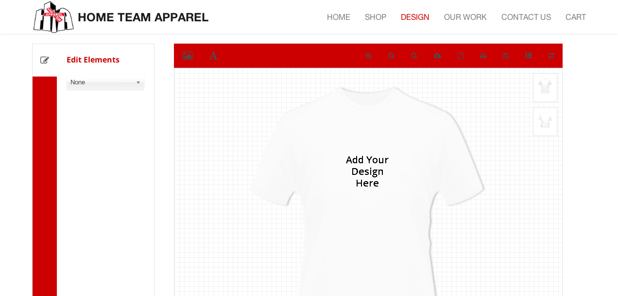
We’ve created an interactive customization page for our client’s customers wherein they can create a personalized shirt using various elements.
People love to interact and feel like they are part of the experience. Notice how these two examples are for very niche products.
You need to maintain the integrity of all aspects of beautiful web design if you choose interactive elements.
However, if you can find something that works for your lane of eCommerce then by all means don’t feel held back.
If it can be incorporated tastefully, then it can really add to your experience.
3. Consistency is Key
Consistency is key. It cannot be repeated enough.
Nothing is more visually unappealing than a hodgepodge of color schemes, fonts, and misplaced menus.
Not only does it detract from your aesthetic, but customers are left wondering where they can even find more information.
Let alone buy your product or service.
It is necessary to keep a consistent theme throughout your website to maintain aesthetic appeal.
But more so to build buyer confidence and come across as a trusted, reputable business.
4. Color Schemes
One of the first things people will visually notice is the use of too many colors.
You probably already have a clean logo made that conveys your message and uses maybe two to three colors.
You want to carry this over to your website as well and only use neutral backgrounds that complement your logo.
Now I’m not going to say that using two bold colors is a strict rule because the adventurous, expert graphic designer can make some palettes work.
Here is a color guide to show you the never-ending combinations of colors you could choose for your own business.

5. Whitespace
Don’t be afraid to make use of whitespace either.
Note that whitespace doesn’t always have to be the color white, but can also be empty blocks of space on your pages.
This gives your beautiful web design more breathing room and makes it easier to find content.
Take for example your favorite high-end retail shops.
Do you see tightly packed shelves with as many clothes as they can fit?
Or do you see large walking areas with each product having its own designated space with room to breathe?
It is a simple design philosophy that can go a long way and immediately emanates quality.
Let’s take a moment to observe Apple’s beautiful web design as well as Brussel’s storefront.
Both make use of minimalist design philosophy where whitespace can really frame your product, and you have room to…
…appreciate what they are showing you.
Just remember, oftentimes less is more.
6. Fonts and Typography
Now when it comes to fonts, you should be practicing the same principles as with your color palette.
You need to limit yourself to only two to three fonts across all headers, menus, and body text.
It not only looks visually appealing, but it is also less discombobulating for the reader.
Notice how on your favorite, well-designed websites, menus may have different fonts than headers/titles and definitely have…
…different fonts than the text in the body.
These are visual cues to let the reader know the purpose of each piece of text and allow for fluid navigation.
Now on to choosing your fonts. Because your headers, menus, and titles will be sparse compared to the body text.
It is okay to use those bold fonts that show your creative flair.
But you still want to maintain cleanliness. So opt for mature fonts and stray away from ones that are illegible or overly stylized.
When it comes to the body, keep in mind that this is the bulk of the text. Not only that, but it will be the most information-dense text.
So you want to make sure it is as digestible as possible and not straining on the eye.
With that being said, the best way to accomplish this is by incorporating san-serif fonts.
These are fonts without serif, the strokes on the ends of letters that when packed together, can cause unnecessary clutter.
After all, the official default language of Microsoft was noticeably changed from…
…Times New Roman, a serif font, to Calibri, a sans-serif font, to usher in a new age of digitally consumed text to improve readability.
There are many ways to create an aesthetically pleasing and more importantly cohesive experience for customers when they land on your website.
I encourage you to continue reading through a few of our other blog articles to get some more in-depth content on this topic.
Here is a good one to get started with 7 simple website solutions to improve user experience.
7. Call to Action
You’ve probably heard what a CTA (Call to Action) is before, but it is often one of the most neglected and important elements of a website.
After all, it is what physically makes the customer purchase or interact with your product or service.
You want to keep in mind the flow of your website and the mental steps you want your customer to take when landing on your homepage.
While your contact information, blog, and about sections are crucial to your business and image.
Once the necessary information has been conveyed to make the customer understand why they should buy what you are selling.
A strong call to action should be the next thing they touch.
This can take the form of directing your customers to a shop, or towards a contact form.
Take a look at the homepage for oursocial media management company.
“Accelerate Your Marketing, Social Media Marketing & Management Agency” is the first thing you encounter when landing on our homepage.
Not only does it initiate a call to action, but it gives you a concise rundown of what we can do for clients.
It also includes fields where the user can interact and begin the process of learning more about our company by speaking to a marketing expert.
Navigation is arguably one of the more important priorities when designing your website. It is the path and experience you will lead your customer down.
The only problem is you will not be there to guide them, so your website needs to be intuitive and accessible so that…
…finding pertinent information feels like it was done by their choice.
Some of the best and most beautiful web designs do this in an intuitive manner by adhering to the visual hierarchies.
The most important information should find itself in front of the user at the top of the page with eye-catching elements such as…
…the use of colors and fonts discussed earlier.
Menus should employ intuitive headings where customers know exactly where to find relevant information.
Call to actions should be highly visible and be part of the first interactions somewhere on the first page.
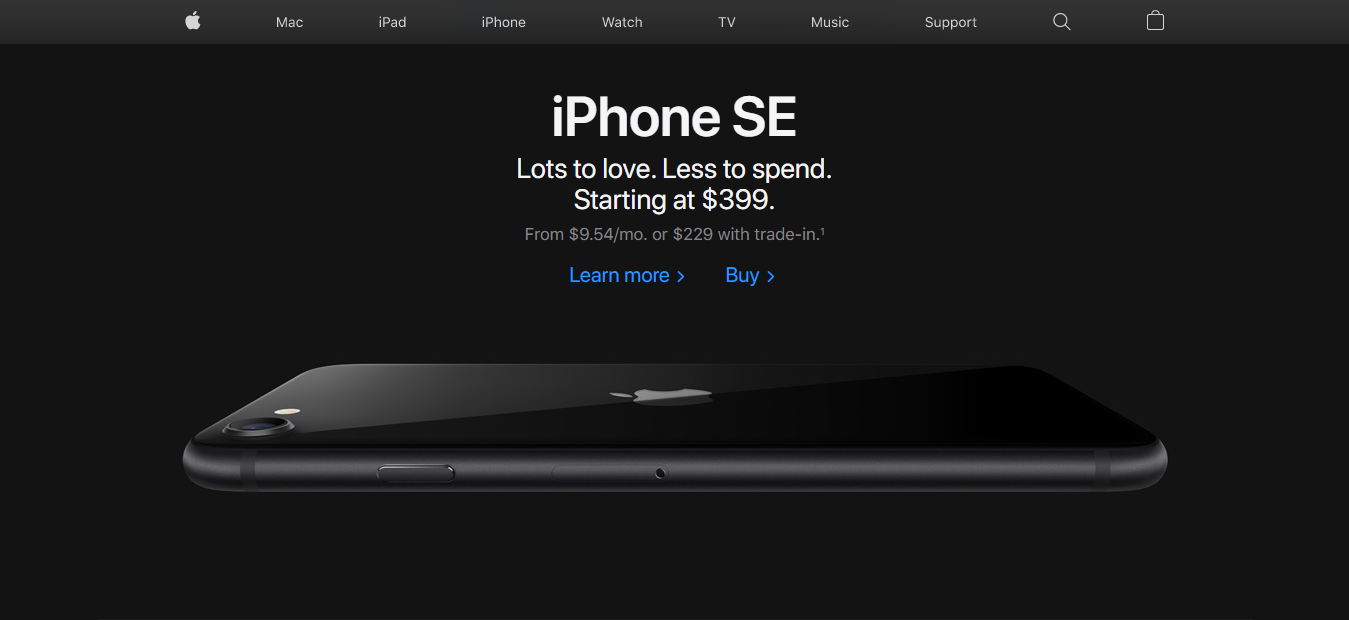
Again let’s take a look at Apple’s website, more specifically their navigation bar for example.
There is no question what each tab houses and finding information on each of their products is as streamline as can be.
Information is not buried at the bottom of the page or in discrete menus hidden on the screen.
Another aspect of navigation to take into consideration is what order the reader will approach the information on the screen.
Left to right? Up and Down? Behind Menus? On another page?
Keep in mind that the customer’s eyes are much faster than their mouse, so try to minimize the number of clicks it takes to access information.
Do this by avoiding excessive menus, and if the information becomes too dense for the same, consider streamlining it to what is necessary.
9. Loading Times
“What about this website has kept me here for the last thirty minutes?” This is the kind of question you hope your consumers are asking themselves.
You may also hope they are thinking, “If their website is this great, then whatever they are offering must be of the utmost quality.”
Consumer psychology is a real phenomenon, especially when dealing with the high-speed volume of the internet.
It also comes into play when dealing with web page loading speeds.
Did you know that on average, a whopping 40% of consumers will abandon a website if it takes more than a mere 3 seconds to load?
Translate that to potential sales and that is a large portion of missed revenue that could be avoided by exercising good practice in website design.
Keep in mind how certain elements will affect your website’s loading speed.
Large high-resolution images will take much longer to load than those of a smaller scale.
A lot of moving parts in the form of widgets or interactive elements have to be processed by your website’s server.
Download speeds and processing times are ultimately what translates into the loading speeds on the user’s end.
So either upgrade the performance of your server or try to keep these to a minimum and exercise minimalism.
Keep in mind people will have varying processor speeds depending on what device they are using to view your website.
As well as varying internet bandwidths.
10. Elevate Your Content
Perhaps what sells to a large percentage of consumers in an eCommerce environment where…
…the customer cannot physically interact with your product, is nothing but photography.
Beautiful, creative, and quality images are your product until it is in the customer’s hands after they have purchased it.
Images are the most easily digestible content that anybody can appreciate.
Quality images can make or break a company, and you have probably yourself purchased things solely off how it was presented to you.
High-resolution photos with a proper composition that frames your product can really build trust in buyers that your photo quality is…
…indicative of the quality of your product.
11. Mobile Compatibility
Keep in mind when designing your winning website, that the way you see your website may not be the only way it will be viewed by customers.
What I mean by that is your website needs to be just as beautiful from your desktop, to your tablet, as well as to your phone.
After all, about 40% of eCommerce transactions are completed on a mobile device, so it is not something to be neglected.
Most modern content management systems do a pretty good job converting your desktop site into a mobile-friendly version.
But it is still pertinent for you to make sure that all of your content is compatible.
Whether you are using a highly optimized template or designing your own custom layout.
You need to take the necessary steps to ensure your website’s photos and text are navigable on a 27” desktop as well as your 5.5” mobile device.
This comes down to optimizing image sizes as well as resolution and aspect ratio. People read from the left to right and then down.
Make sure text and images are broken up ideally when converting your site to mobile.
What to Avoid
Throughout this article, I have given you some invaluable guidelines for crafting your…
…beautiful web design experience and have also touched on what not to do.
I think a big component of how a beautiful web design comes together is the designer’s approach and…
…their mindset when coming up with the path they would like to lead their users down.
Now I would like to touch on a few things to keep in mind and avoid when starting out.
You goal should be to build trust that surrounds all elements of your website.
Again this boils down to consumer psychology and who they are willing to conduct business with.
12. Pop-Ups
Avoid pop-ups wherever necessary, especially on your homepage.
You have definitely encountered them before if you use the internet, and you know how annoying and distracting they can be.
On top of that, it can lend itself to distrust because it feels like you are asking something of the…
…consumer as the first step in your business relationship rather than providing them with an experience.
Customer experience comes first, and more importantly, the content you worked so hard on should be the primary focus.
Of course, you still want your customers to become part of your email list, and receive newsletter updates on your business.
But there are better ways to achieve this.
Call to action prompts are probably the best way to mitigate the necessity for pop-ups and can be stylized to be the focus of the screen.
Also, enticing customers with reasons to follow your business followed by a hyperlink is a good way to make them feel like…
…it was their choice rather than a key to access your site.
13. Walls of Text
Avoid large blocks of text. This is a common theme in almost all forms of writing.
Large walls of text not only decrease readability but make it hard to reference or even find any relevant information.
You don’t want your reader falling asleep, so try to break up any text.
You shouldn’t find yourself putting too much text on any one page in any case.
To avoid this, try using big headers that more or less sum up the information they will find in any preceding text.
And try to keep the body of writing as trim as possible.
14. Ambiguity and Scan-ability
This is probably one of the worst offenders of beautiful web design, especially among the more creative types.
Although it is one of the easiest to fix. What I’m referring to is the first impressions of your website making it unclear what it is exactly you do or sell.
A lot of people fall prey to this when designing their logo or even coming up with their brand name.
Avoid the trap of bombarding your customers with ambiguous photography or text without making it very clear what you are selling.
You don’t want your readers to guess what exactly it is that you do because they will find themselves wondering if it is worth their time to continue forward.
A good test to really drive this point home is to find someone who has not yet heard of your business and…
…see how long it takes them from the moment they land on your homepage to guess what it is you sell.
This will give you a good idea of what most readers will experience.
Your page should be quickly scannable with plenty of whitespaces to break up text and images.
Most people read websites in an E or F pattern, meaning from left to right and then down.
Take this into account when making your website scannable as well as information-dense.
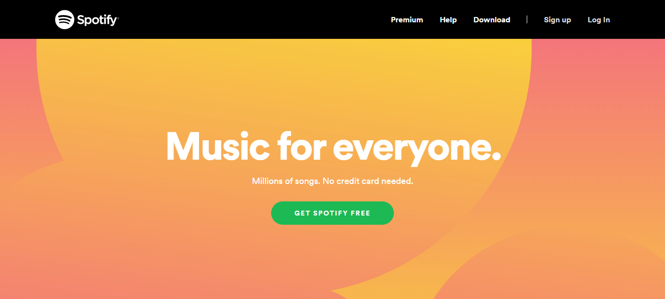
Take a look at Spotify’s website. Simple and to the point.
There is no question what kind of service they offer with their eye-catching ‘Music for Everyone’ header.
Not only that, notice their minimalist design with eye-catching colors, fantastic use of white space, and calls to action that are hard to miss.
Notice specifically, how they use the brand’s green theme for the enticing ‘Get Spotify Free’ call to action button.
These visual cues come together for a beautiful web design that is both intuitive while minimalist.
A Word on Minimalism
Minimalism is something that design experts take to heart.
It is a design principle that doesn’t mean to use only black and white elements with little artistic flair, but rather embrace the concept that less is more.
A clean and simple website has a distilled purpose that is much more easily conveyed to the consumer.
It is in essence, the lack of redundancy and distraction from what you really want the customer to see.
Whether it be your homepage, about page, or even your product pages, keep it simple.
You are designing a website for a user that doesn’t know a thing about your business.
And, it is very easy to over-design a website for an expert on your topic such as yourself.
There is a common expression in the user design space that may sound counter-intuitive.
But if the consumer cannot tell what you are selling, or they cannot navigate your website, the problem actually rests on your design and not them.
You should have a clear idea of the mental navigation a customer will take when landing on your homepage.
The last thing you want is to distract customers from making a purchase by using…
…pop-ups, prioritizing an about page, or annoying them with unnecessary widgets.
A good rule of thumb is to minimize how many clicks it physically takes for a customer to purchase a product.
A less stressed customer is more willing to hand you money. Again, impressions are everything.
Impact of a Beautifully Designed Website
Now you must be thinking, “Where do I even begin with crafting my beautiful website?”
It may seem daunting to digest and incorporate all of this information, and it may seem equally frustrating to learn how to technically apply it.
Do not fret. Rome was not built in a day.
While there are many templates out there to begin your journey into honing your beautiful web design, at the end of the day templates are templates.
It is doable, but harder to exercise personality within a template.
The idea of crafting a beautiful web design hinges on you selling what makes you different which manifests itself in your creative flair.
An aesthetically pleasing, intuitive, responsive, and most importantly beautiful web design can make all the difference for the success of your…
…company and can translate directly into increased revenue.
If you still have questions on what you can do to elevate your website, or are unsure of where to even start.
Feel welcome to contact us to discuss how we can help you grow your business.
If you would like to continue reading on how to optimize your web design, check out our blog about SEO web design to maximize traffic and conversions.
Other Website Design Resources
- Basic Website Design Elements Every Business Should Have
- How You Too Can Achieve Award-Winning Website Design
- Mobile Website Design: What Customers Want to See on Their Phones
- 9 Elements of Cool Website Design For Your Business Page
- Results-Proven Methods to Creating Great Web Design
- 16 Great Web Design Tips to Improve your Bounce Rate
- Top 10 Reasons SEO Web Design is Important for Business Success
- 10 Web Design Best Practices for Greater Business Success
- 11 Important Characteristics of Effective Website Design
- Why Simple Website Design is the Best Website Design
