Take a look at any company and the first thing you notice is what? The graphics, right? Whether it’s an ad, a GIF social media post, brochure, flyer etc.
A picture is generally worth a thousand words but in this case it’s worth at least 58 graphic design terms.
These 58 graphic design terms will help you navigate through the world of graphic design with ease.
Knowing which terms have what meaning and how they will apply to your marketing campaign’s digital images are vital to any company.
With so many graphic design terms out there it can all get a bit chaotic.
Which is why I’ve decided to separate them by four categories to make it a little easier to sift through: color, design, type and branding.
Let us get started with the first thing that draws our attention, color.
As discussed in one of our recent blogs 10 creative graphic design tips for social media we mentioned how important color was in a social media campaign.
Now let us get into which terms have what meanings and why it’s important to your digital marketing campaign!
1. CMYK
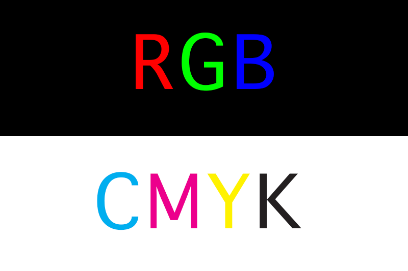
This is the perfect color model for your print products. CMYK is a 4-color printing process made up of cyan, magenta, yellow and black.
These colors work best on print objects.
Ever wonder why you pick a beautiful color on the screen only to have it print in a shade other than what the screen showed?
Chances are you’ve picked the wrong color format, luckily now you know the difference!
2. RGB
When dealing with anything digital RGB is the color format you need to aim for.
RGB stands for red, green, and blue, these three colors are perfect for any display type of digital screen.
Hues, Tones, Shades, oh my!
3. Hue
Hues are the purest form of original colors. They are red, orange, yellow, green, blue, and violet.
4. Shade
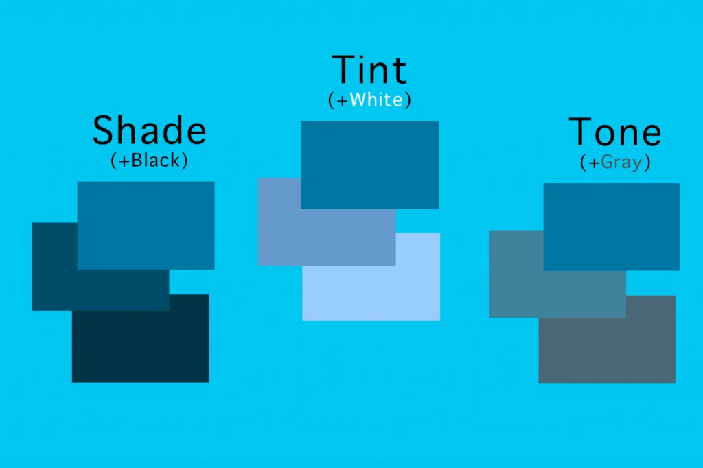
Shade is the addition of black into pure color.
5. Tint
Tint is the addition of white into pure color.
6. Tone
Tone is known as the addition of gray into pure color.
7. Saturation
Take a second to think of all the bright and colorful pictures that you see on websites or social media platforms.
Chances are the designer behind that image saturated the picture to make it look more appealing to the eye.
Saturation is the intensity and vividness of a color.
8. Gradient
Gradient is a gradual change from one color to another.
This type of graphic design approach is exactly what Instagram did when they changed their logo.

9. Hex code
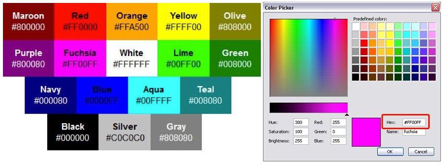
A hex is a six-digit number that follows a hashtag. It is used to represent colors and often what graphic designers use in computer design programs.
It is also useful when editing colors in HTML format.
10. Palette
A color palette is more than just the range of colors used in a design. These are colors that work well together and will bring your brand together.
Think like how Joanna Gaines has a distinct color palette she uses for her farmhouse remodels.
These next few terms can seem a little daunting and hard to understand.
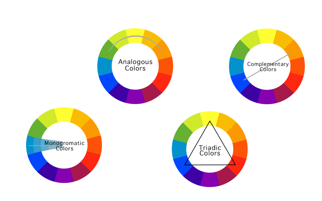
Don’t worry, I’ve included a nice little graph to explain visually what they mean. I mean this is a Graphic Design terms article after all.
11. Monochrome
A monochromatic color palette uses various tones with only one color.
12. Analogous
Analogous colors are known as colors that are adjacent to one another on the color wheel (Example: red-violet, red, and red-orange).
13. Complementary
Complementary colors are opposites on the color wheel. This is almost like a contrast and will give some of your graphics that extra “POP!”
14. Triadic
Triadic colors are three colors that are spaced evenly on the color wheel.
One color will be the dominant color, the second will support, and the third will be the accent color.
15. Pantone
The “Pantone Matching System” is a standardized color system, created especially for identifying each tone with exact precision.
Thus, every color included in this classification is numbered with the goal of simplifying the process of using an exact color tone in designs and prints.
16. Warm Colors
Warm colors can be found on one half of the color wheel (reds, oranges, yellows and pinks).
17. Cool Colors
Cool colors occupy the other half (blues, greens and purples).
18. Color Theory
The study of how colors make people feel and their effects on a design is known as color theory.
Color theory is used to explore the best types of colors to work in different design instances.
For example, choosing a pastel scheme for a website that needs to feel soft. Or picking red and yellow for a magazine ad that needs to evoke energy.
Now that we have your colors fully color-ed. (see what I did there?) Let us move on to the design aspect of your digital marketing campaign.
These next few graphic design terms will help bring your campaign a little closer to being the best.
19. Contrast
Contrast is when one element is completely different from another. Your designer may use color, shape, texture, size or typeface to create contrast.

20. Balance
This graphic design term is very important when keeping your audience engaged as the aesthetics of your page will either attract or…
…repel potential consumers.
Balance is the placement of elements on the page so that the text body copy and graphics are equally distributed.
21. Mock Up
When graphic designers are creating a mock-up, they are creating a realistic representation of how the design will look when full size.
Most designers use Adobe products for this. Adobe Photoshop for creating and designing image files while Adobe Illustrator for vector file formats.
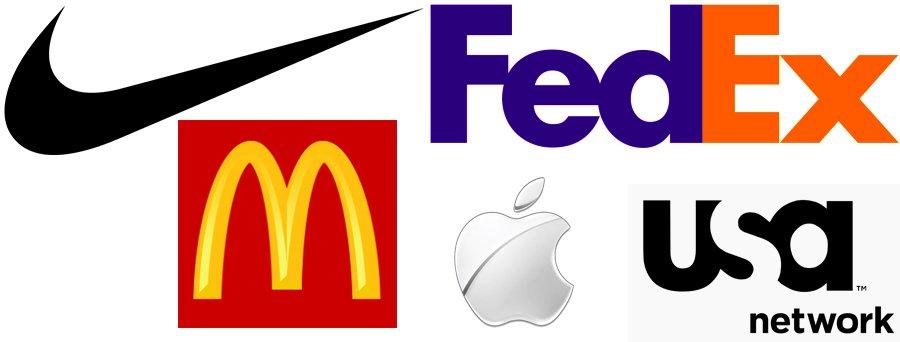
22. Negative Space
Any space that surrounds the elements of your main design is called negative space.
It is important to have this in order to give the eyes some “breathing room”.
You’ll often notice that the most well-known logos and brand designs involve a great deal of negative space.
Remember, negative space doesn’t always mean white space.
23. Opacity
Opacity is when an object lacks transparency. Think of a black circle.
That circle with a high percent of transparency lets you see what lies behind it. Whereas when you apply a higher opacity it becomes more solid.
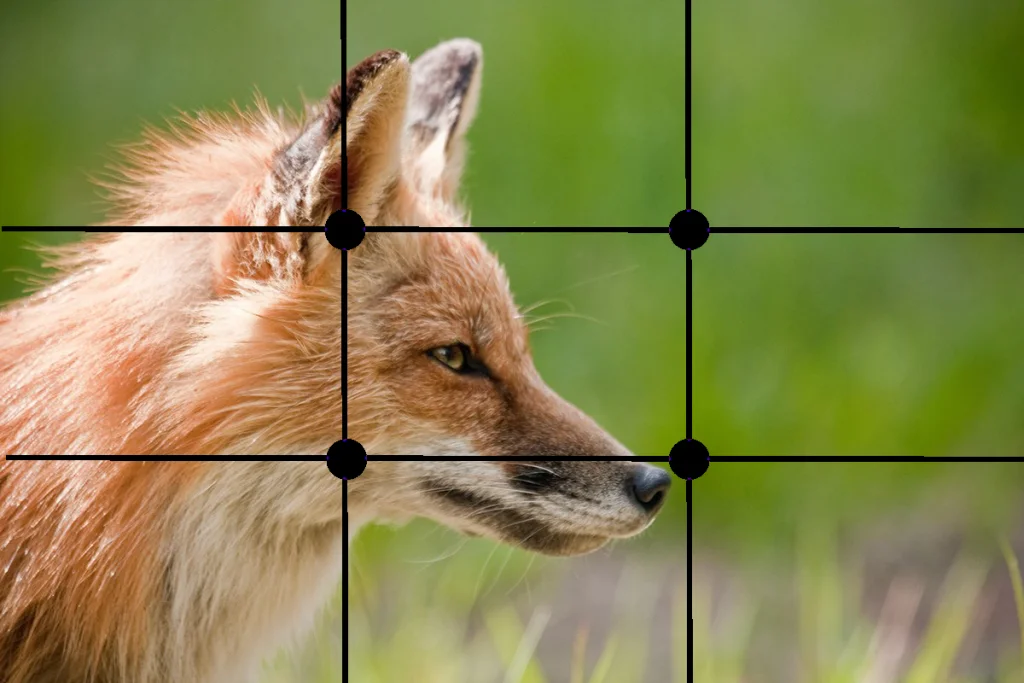
24. Rule of Thirds
The rule of thirds is a neat little technique that many designers are taught to use to determine a graphics focal point.
Using a grid of three rows and columns, focal points are indicated where the lines overlap.
Designers use this as a guide to determine where to place important elements in their design.
This is especially important to your digital marketing advertisements because with the number of ads out there today.
You want to make sure your ads are the ones that stand out to potential customers over competitors.
25. Scale
Scale is the size of an object in relation to another element.
26. Texture
When it comes to design, texture can refer to the actual visual tactility of your design.
Want your design to have a mirror or cut-out effect? The texture on your graphics can do this.
A texture is defined as the feel, appearance, or consistency of a surface or a substance. And in design, a texture can mirror that.
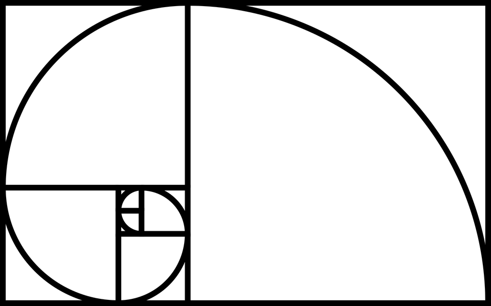
27. Golden Ratio
The Golden Ratio is a common ratio that is found in life that is usually used in design to create pleasing and natural-looking elements in your work.
Many people use it when creating logos, graphics, and even website designs.
28. Knolling
Knolling is when you arrange different elements at 90-degree angles from each other and then photograph them from above.
This amazing technique creates a very symmetrical look that will give your customers a pleasing feeling.
29. Skeuomorphism
Try saying that three times fast! Skeuomorphism is when a digital element is designed to look like a replica of the physical work.
Think of the calculator app on your phone. It looks a lot like the real thing, right? Well, that’s Skeuomorphism.
The more you use this technique, the better you can resonate with potential customers through a computer screen, phone, or tablet.
30. Image resolution
With all the graphic design terms this might just be one of the most important digital ones.
The detail of an image is based on the number of pixels in the picture – which is known as resolution.
When an image looks clearer then it has a higher resolution.
When the resolution is low resolution it can become pixelated. The higher the resolution the better the image.
The better the image the more likely a potential client is to stay on your page a bit longer because you look more professional and they trust you.
Poor quality images immediately make your business lose credibility with anyone that sees them.
31. Pixels Per Inch and Dots Per Inch
Pixels Per Inch (PPI) refers to display resolution or how many individual pixels are displayed in an inch of a digital image.
On the other hand, Dots Per Inch (DPI) refers to printer resolution or the number of dots of ink on a printed image.
32. JPG and PNG images
If you’re fond of downloading images from stock photo sites, these might look the same to you but both are image formats for different purposes.
A JPG format contains a plethora of colors and is great if you plan to share images on social platforms, such as Facebook, Instagram, Pinterest, etc.
However, PNG is the perfect candidate for supporting better quality photos, such as logos, and great for keeping the quality of an image.
33. JPG and PNG images
These might look the same to you but both are image formats for different purposes.
A JPG format contains a plethora of colors and is great if you plan to share images on social platforms, such as Facebook, Instagram, Pinterest, etc.
However, PNG is the perfect candidate for supporting better quality photos, such as logos, and great for keeping the quality of an image.
34. Vector images
Vector images are made up of points, lines, and curves using a mathematical equation which means the image can scale in size without losing any quality.
Meaning they won’t get blurry when scaled.
35. Raster Images
Raster graphics are composed of pixels on a grid. They are great for special effects, color correction, and manipulating photos.
However, raster images are resolution-dependent, which means that images cannot be enlarged without degrading their quality.
Ever look at those articles that poke fun at the bad typography in logos and signs?
That is why it is critical to know these graphic design terms and how to apply them to your logo – so you won’t become one of those spoofs!
Below are some key terms that will help you to avoid being caught on those roast articles and score you a spot on the “Best Typography” list…
…if there was one of course!
36. Typography
Typography is the visual component of a written word.
37. Kerning
Kerning is the adjustment of space between pairs of letters in the same word.
38. Tracking
Tracking is the alteration of space for entire words and blocks of text.
![]()
39. Leading
This is the space between two lines of text, also known as the “line-height”.
40. Typesetting
Typesetting is the way the texts are composed using individual types such as the symbols, letters and glyphs in digital systems.
41. Font
A font is a group of characters in a certain size and style. Think Arial Bold, Arial Italic, Arial Regular.
42. Typeface
A typeface is a family of fonts. Think Times New Roman, Arial, or Cambria.
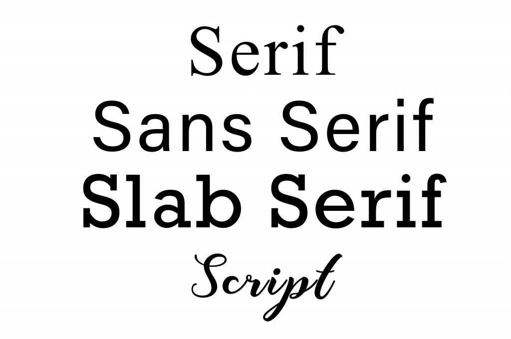
43. Serif
Serifs are the small flourishes at the end of the strokes in some letters. (Example: Times New Roman).
Serif typefaces are said to aid in the readability or legibility of a body copy.
44. Sans Serif
Sans means “without.” A sans serif font has no serifs, meaning no small flourishes. (Example: Arial)
45. Slab Serif
Slab serif have thick, block serifs. (Example: Courier New)
46. Script
A typeface that uses a flowing, cursive stroke.
47. Letters
When capital letters are used in text or graphics, it is mostly to indicate a strong feeling or is an acronym.
Meanwhile, lowercase letters are the opposite of capital or uppercase letters.
48. Ascender and Descender
An ascender is the part of lowercase letters that extends above the mean line of a font or x-height.
On the other hand, the descender is the part that appears below the baseline of a font.
Letters with descenders are usually: g, j, p, q, y. In some typefaces, lowercase f and z also have descenders.
49. Widows or Orphans
Widow is a very short line, usually found at the end of a paragraph which is separated from the rest of the text.
It means that this line is either in the next column or in the next page.
It can also appear as an opening line of a paragraph at the bottom of the column or a page, thus separated from the rest of the paragraph.
Orphan, on the other hand, is a word or few words in its own row that end a paragraph, thus creating too much white space between paragraphs.
50. Typographic Hierarchy
This is a system for organizing the texts in a web page that creates an order within the content thus allowing readers to…
…easily scan and find what they are searching for.
It guides the eyes to where each section of content begins and ends.
51. Lorem Ipsum
Lorem ipsum is dummy text used by web designers as placeholder text. This is used when the final copy is not yet ready.
It has enough distribution of letters which allows it to look like readable in English language.
On to the last section of our graphic design terms, branding. The moment we’ve all been waiting for.
Learn how these graphic design terms actually pull together to help make your digital marketing campaign stand out from the rest!
Keep reading for the final graphic design terms to finish fueling your brain with all the design savvy words there are to know!
52. Brand Identity
Your brand identity is a visual representation that describe the values, mission and background of your company.
This will include logos, business cards, memos, packaging design, etc. This will outline your brand in its entirety.
Making sure your brand has the proper, fonts, colors, emotions, logos and aesthetic will ensure that you build brand awareness in the best way possible.
53. Logotype
A logotype is the name of a company that is designed in a visually unique way for use by that company.
Most of the time when people refer to a logo, they’re referring to the brand’s logotype not the actual mark. Examples include: Google, Disney, Coca-Cola.
54. LogoMark
A logo mark usually doesn’t contain the name of the company, it is more of an abstract representation that your company uses.
Usually in a symbol or mark. (An example would be Nike, Target, Apple)
55. Collateral
Your brand’s collateral pieces are the physical, visible objects that have been created to represent your specific brand.
Collateral can include things like brochures, flyers, social media ads and even digital and print signs at an event.
56. Grid
A grid is evenly divided columns and rows that will arrange elements for a company in a consistent way.
Whether it be for social media layouts, website layouts or just day-to-day activities.
Grids are used to align design elements in a more efficient and accurate way.
57. Trademark
A trademark is a symbol, word, phrase, or design that you can use to distinguish your products or goods from those of competitors.
Most companies will need to apply for this.
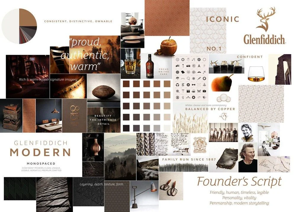
58. Mood board
Mood boards aren’t just for New Year’s Resolutions and self-proclaimed goals!
These boards are great when putting together images, text and other visual elements that can and will define your brand.
When words simply aren’t enough to describe your brand, mood boards are perfect.
Wrapping Up
Phew, that seems like a lot doesn’t it? Don’t worry you can always come back to reference if need be.
But these graphic design terms will not only help with your social media campaigns but your entire marketing campaign as well.
Now that you are design savvy in the graphics department put these graphic design terms to…
…use and make your company’s marketing campaign outshine the rest! Don’t want to do it yourself?
Consider working with one of our design professionals.
Now you’ll be able to speak his/her lingo when it comes to creating designs for your digital marketing campaign. Contact us today!
Know some graphic design terms we missed? Comment below and share, let’s keep this thing going!
Other Marketing Terms Resources
- ROAS: Understanding Your Return on Ad Spend
- SEM Advertising: A Fast and Efficient Way to Generate Revenue
- Social Listening: Your Path To Success On Social Media
- Reach vs Impressions: Why You Need to Know the Difference
- What is Email Marketing & Why Does My Business Need It?
- What is ROAS? The Guide to Improving Your Return on Ad Spend
- What is Web Marketing? – Expert Answer
- What Does SEO Mean? Here’s Everything You Need to Know
- Remarketing vs. Retargeting – What Do They Mean & How Do I Use Them?
- ROAS for Small Business: How Can You Maximize It?


