It’s no secret, humans are attracted to aesthetic things.
This affinity for beauty can be used to your advantage when creating your business graphics.
And in today’s post, we’re going to give you tips on the beautiful art that is typography.
As well as how to use it to grab people’s attention with your digital marketing graphics.
Typography is the strategic arrangement of text in order to make written language readable and visually attractive.
It’s an essential part of visual marketing as text is an important means of communicating what you’re selling or what you offer.
Keeping in mind how important it is, these are 8 essential typography tips.
Let’s dive in!
8 Typography Tips For Your Digital Marketing Graphics
Tip #1: Adjust your text kerning and size so that your graphic is readable
Kerning is the spacing between letters in a piece of text.
This, along with proper text sizing, can easily determine how well your graphic’s wording can be read.
Keep in mind that most digital media is consumed through mobile devices.
And with that in mind, be sure you’re giving enough space between letters to be easily read from even small screens.
Tip #2: Match complimenting typefaces
A typeface is a collection of fonts while a font refers to a specific style or weight within a typeface family.
Like how some typefaces have bold, semi-bold, light, and italic versions, there are multiple typefaces:
- sans serif,

- serif,

- script,

- decorative

…among other sub-variants.
Matching different typeface variants can be a great way to contrast them…


…but be careful not to use more than a combination of 2 typefaces per graphic.
That way you’re not introducing too many different visual forms of text…
…but have just enough variety to add more depth into your typography creating a more interesting visual experience for your audience.
Tip #3: Have a library of great fonts
There are great fonts, ok fonts, and there are some truly terrible fonts out there in this great big world.
So the third one on our list of typography tips is keeping a library of fonts and font combinations that you like.
This will help you streamline your design process and let you have easy access to the right font families for different types of graphics.
There are a bunch of great font sites to purchase paid fonts from.
But, sites like Google Fonts are great for getting all of the typefaces, not to mention that all fonts listed in their directory are open source.
This means that you can use them in any non-commercial or commercial project.
Tip #4: Use script and decorative fonts only in short texts
If you’re making graphics that feature longer forms of text like a review, a quote, or infographics…
…do not, we repeat, do not use a script or decorative fonts on the long-form text.

This will make it extremely hard to read for the viewer and will ultimately cause them to skip reading through the graphic entirely.
Simplicity is key in visual design, and in creating quality business graphics.

Sticking to serif or sans serif fonts for longer texts on graphics will make it easy for your audience to read through your image.

Tip #5: Add textures
The next one on our list of typography tips is about textures.
Simplicity is the #1 priority for visual design but there are times when you’ll want to make exceptions to that rule.
Every now and then adding textures or extra features to your text can dramatically improve the visual impact it gives to your audience.
So you can save this for special events, sales, or seasonal graphics.
Be sure to use this sparingly, and if you do decide to add more character to your font…
…balance that out by minimizing the decorative elements and textures in the background and the rest of your composition.
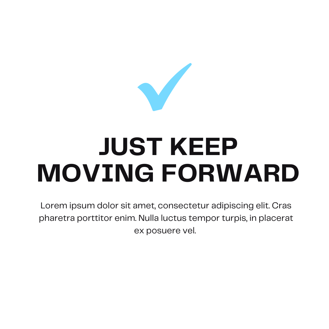
Tip #6: Practice typographic hierarchy
Moving on to our list of typography tips is the hierarchy.
Typographic hierarchy is a system for organizing text that establishes the order of importance within the graphic…
…creating a visual flow or path for the eyes when they navigate through your image.
A headline is usually at the very top of all text in a graphic. It’s usually not very long and its purpose is to catch the viewer’s attention.
It is then followed by a subheading that has more information.
Which in turn is followed by a full paragraph copy that contains more details.

Depending on the graphic you’re making, you may omit different parts of the hierarchy.
Ad graphics, for example, don’t usually have a full paragraph copy.
They usually only have a headline, and in some cases, have a subheading and a call to action button.
Sometimes you may want just a headline as a message in a social media graphic.
Regardless of the graphic you’re making, remember that your text must always be in the proper order of importance.
And there should visibly be a difference in text size and optionally text weight between the different parts of the typographic hierarchy.
Tip #7: Do not combine multiple alignment setups
This may seem simple yet it makes such a huge difference in the uniformity of your graphic.
Center, aligned right, or aligned left, pick one alignment of text and follow that through the entire graphic.

Do not mix and match.
Don’t leave a headline centered and place a short paragraph under it aligned to the left.

If you do that, it will only disrupt the visual flow of the image and will make it look less put together.
Tip #8: Use complementing colors
This goes without saying, but no matter how great your chosen font or fonts are…
…you will never be able to present it in its full glory with colors that clash and don’t go with your typography.
So the last on our list of typography tips is about colors.
Be sure you’re using colors or color combinations that compliment your font and look great when combined.
Sites like Coolors…

…or Color Hunt…

…are great for this as it gives you different complimenting color combinations to use for your typography and other graphic elements.
Also, try not to use any more than 2 colors for text on a single graphic.
There will be times when you’ll have to make exceptions to this rule though, but in general, 1-2 font colors, that is it, that’s your safe zone.
Speaking of colors, you can also check out our color psychology post next to help you choose the perfect color palette for your business.
And that is it for today’s typography tips!
With these in mind, you’re on your way to making better typography for your business graphics.
And if you need any help with your digital marketing graphics, you can get our graphic design services today.
Simply get in touch with us at 404-596-7925.


