


So you need website solutions to create a better experience for customers. Well, then you’ve come to the right place because…
81% of customers today research online first. Even if you are a brick-and-mortar business, a customer’s first interaction with you is usually digital.
60% of people who visit a website expect to buy something that day.
If you don’t provide a seamless user experience, that purchase will be made elsewhere.
Analysts expect the user experience to be more important than either price or the product by 2022.
Customers no longer expect you just to have a small business website. They expect seamlessly.
Fortunately, it’s not as hard to design that experience as you might think.
Let’s explore 7 simple website solutions you can apply now to increase revenues while delighting your customers.
7 Website Solutions For Your Business
1. Test Your Mobile Friendliness
Mobile website design matters. Over 50% of website traffic now comes in through mobile devices.
We’ve reached a tipping point where ignoring mobile experience could impact over half of your potential customers.
That’s why many no longer say be “mobile-friendly”. They say put “mobile-first”.

According to the marketing research firm ImpactBND, 48% of people say they feel “frustrated” with a business that doesn’t have a mobile-friendly site.
An astounding 91% say they aren’t likely to have further dealings with your brand.
Test your website on multiple mobile devices. Know how it renders. Don’t assume that it works.
Some popular out-of-the-box website design programs say that they make your site mobile-friendly for you.
This isn’t always the case. And, over time, it gets worse as you make changes.
View it manually on a regular basis. Then use tools to further identify areas of improvement. Here are a few free mobile testing websites to try:
- Google Mobile-Friendly Test (free)
- Bing Mobile-Friendliness Tool (free)
- SmallSEOtools (free)
- Dynatrace (free 15-day trial)

What to Look For
Do you have to scroll back and forth? Do you have to enlarge the screen to read?
Are images getting cut off unless you minimize the screen? Do you have to do similar acrobatics to navigate from page to page?
Are multiple columns trying to display on the screen at once?
Then it’s not a mobile-first site.
And what about load time? 47% of people expect mobile sites to load within 2 seconds. 40% leave a site that takes more than 3 seconds to load.
Once you’ve determined that you don’t have a mobile-first site, it’s time to start applying website solutions to improve user experience.
Given the importance of mobile user experience, we’ll be discussing these in detail within the remaining 6 website solutions.
2. Make It Readable & Legible
Legibility and readability not only impact your user experience.
They can impact your conversion rate for the simple reason that people can’t read your pages.
Did you know that by middle age the average person has lost 50% of their ability to perceive light? Screens, text, and images all seem a little darker.
It’s harder to distinguish between text and the page it’s sitting on. As you age, the challenge becomes greater.
1 in 10 individuals, regardless of age, have some form of visual challenge that corrective lenses can’t fully correct.
It doesn’t matter what device a person is viewing a website on, they have to be able to read it to buy.
Even if you’re a trendy, youthful brand, if your page isn’t very legible, you instantly alienate a major portion of your customer base.
Legibility factors include:
- Size
- Contrast
- Color
- Font Style
- Background
Readability Includes:
- Formatting
- Language
- Writing style
Let’s look at each of these in detail.
a. Size
The average small business website is using a size 12 font that doesn’t clearly contrast against the background.
They think this is big enough because term papers in school are typically size 12 fonts.
You’d probably get a reduced grade if you used size 14 or 16 for your paper.
But viewing on a screen and viewing black text on a crisp white background are two very different things.
Studies have shown that people “hate” small fonts on websites. Yes, they used that word.
To provide the best user experience, your body font should be no less than 16 if you’re using a standard font style like Arial or Times New Roman.
If you choose to use a “creative font style”, it may need to be bigger to be clearly read.
b. Contrast

Some people can read light font on a dark background better. But most can read dark font on a light background. This is usually your best bet.
Whichever you choose, remember that contrast matters.
The light gray font on a dark gray background may look very aesthetically pleasing. But most people will find it hard to read.
c. Color
Strange color schemes like bright blue on a deep red can make it difficult for the eyes to focus.
It’s funny that simple website solutions like these matter so much. But they do.
You can kill your conversion rate with obnoxious color schemes. They actually hurt your customer’s eyes after they read for a short time.
Also, colors set the tone and unify your brand. It helps users to easily navigate through your web pages and perform an action.
This year, designers are opting back to black and white to highlight their designs more and emphasize headings and CTAs.
Studies have also shown that using these colors creates a greater effect when combined with an accent color.
d. Font Style
Around 13% of 20 somethings have astigmatism.
This eye condition makes it harder to focus on certain font styles. The prevalence goes up to 60% for the 65+ age group.
Avoid font styles that are thin and/or excessively curvy. People with astigmatism can’t read them very well.
Something as simple as a wrong font style could absolutely wreck your user experience.
If you use these artistic fonts, reserve them for headings that will be much larger.
For ultimate legibility, stick with Arial or Times New Roman.
You’ll find other styles that make the cut. Just test them out before you do your whole website in it.
e. Background
It’s common today to have words over a moving or still picture background. This is okay as long as the text is not obscured by the image.
Carefully place text so that it doesn’t touch the image in the picture or blend into the background.
f. Formatting (Lots of White Space)
Website reading isn’t the same as reading a book. It’s harder to follow long paragraphs — especially on devices.
People don’t read web content like they read a book either. They don’t start at the top and read straight down.
Actually, they read in more of an “F” pattern.
Researchers have used heat map technology to track the eye movements of web content readers to determine this.

A visitor reads the heading. They then read few lines. Their eyes then scan straight down the left side of the page.
Pages with short paragraphs and ample, short left-aligned headings make a page easy to scan.
If the person finds a heading interesting as they scan the page, they’ll stop to read. This keeps people on the page longer.
Dwell time is a known factor that search engines use to rank your site. To Google, it indicates that you’re providing a great user experience.
User-friendly formatting keeps people on the page longer to improve SEO. That’s great for your site visibility in searches.
g. Language
You should write in a language that is generally understood and used by your customers.
If your customers are niche professionals you might use some jargon.
If they are not specialized, then jargon may get lost in translation.
h. Writing Style
If your audience tends to speak very formally, then formal language makes sense.
You would pay close attention to grammar rules. You would never break them.
If they speak more casually, they’ll likely prefer a less formal, more conversational writing style.
This may include the occasional sentence fragment or sentence ending in “to”. These will sound more natural.
Always consider the brand image and your audience when developing a style.
Just because you’re marketing to professionals, for example, doesn’t mean that buttoned-up grammar is the best way to go.
Using overly “casual grammar” to appeal to groups of people who speak this way among friends can seem mocking if it doesn’t match your brand image.
In either case, this is a bad user experience you can avoid by knowing your customers.
3. Make It Fast
There are many things you can do today to make your website faster. Other website solutions will require the assistance of an expert.
Let’s start simple. Then we’ll look at more advanced speed solutions.
a. Internet-Friendly Images
Whenever you put an image on a webpage, that website has to retrieve the image from a stored location.
The bigger the image file, the longer it takes to retrieve it.
And most small businesses are using image sizes that are way too big for their website.
You can also adjust the image size in the code or in a field in those out-of-the-box websites.
But avoid this. If you didn’t actually reduce the size of the image, your website still has to retrieve the larger image before resizing it to display it.
That takes time.
Use Photoshop or other image editors to reduce the size of your images.
As a general rule, a standard across the page image should be no more than 600 pixels in width.
This is really simple to do by opening the image file then going to resize the image on either PC or Mac.

You can also often reduce resolution without hurting the user experience.
On a PC, go to “save as”. On a Mac, you will hit “export”.
You will then see an option that looks something like this.
Reduce image quality as far as you can without making the image blurry or pixelized. That would be bad for the user experience.

b. Reduce the Number of External Scripts and Plugins
External scripts are important for a website. These are 3rd party tools that your site uses.
Examples are:
- Facebook like counters
- Google Analytics
- Lead Capture Tools
- External fonts
- External comment systems like Disqus
Some of these tools may be very important to your strategy so don’t get rid of all of them.
But be aware of how many of these widgets and tools your site has to load.
Trim what you can. Remove them from major landing pages so that those load really fast.
In some cases, you can have these tools written into your code instead of loading them from an external location.
Review your external scripts and plugins regularly. If they’re not benefiting user experience significantly, get rid of them.
Speed up your site.
c. Eliminate Code Duplication
Now we’re moving into more advanced website solutions. We don’t recommend that you take this on unless you’re a talented programmer.
Websites can become bloated by repetitive code.
This happens as applications are placed on others. Things don’t get deleted. Or code is borrowed from somewhere else.
In order to load your page, your host must read all of the code. Compressing and getting rid of excess code can speed up a site.
d. Have Text Load Before Images
This is another of the more advanced website solutions.
You can program the site to load all of your text first. Then retrieve the images.
This allows a visitor to start reading unaware that the page hasn’t fully loaded.
A poorly thought-out menu frustrates visitors. They can’t find what they’re looking for. They feel like you’re hiding something important.
This drives people away who actually want to explore your site.
Let’s look at what makes a user-friendly menu.
a. It’s Simple & Intuitive
An effective menu has as few choices as possible. A person shouldn’t have to think very hard about where to go next.
Menus aren’t the time to get creative or enigmatic. The site should simply compel them toward taking that next action.
b. It’s Tiered
If you have more than 3-5 menu items that are must-have, tier them into a drop-down.
Rather than listing each of your services as a menu tab, it makes more sense to list them in a drop-down.
It will be very clear to the visitor that if they click on services, they’ll see your services.
Even if you use a drop-down system, limit the number of pages as much as possible. Choice paralysis is a common problem with customers.
If you give them too many choices, they get frustrated and leave.
c. It May Be Different from Page to Page
A menu provides the person on that page with only the choices that are most relevant to them.
Those choices continue the buyer’s journey with your brand.
For example, it may not make sense to include a link to your blog on the contact page, case study page, reviews page, etc.
If they’re on these pages, then they’ve advanced past the stage where a blog would influence their decision.
Some businesses also find it very effective not to link to pricing, case studies, or reviews from the blog page.
Not having these prominently on the page allows a visitor to get to know you through your blog first.
They can then click on your home page to get a more complete menu.
d. It Has a Search Box
Sites that have a search box have a 34% higher conversion rate. People can find what they want fast without having to search through your menu.
5. Make It Helpful
A Label Insights study reported in INC magazine found that 73% of people will pay more for something if the company seems 100% transparent.
39% will switch brands if they find that another brand is more transparent.
94% will be loyal to a brand that continues to demonstrate transparent behavior.
The psychology behind this is clear.
If a brand seems elusive, people wonder if they’ll really get what they paid for. They’re willing to pay more to make sure they do.
56% say they’re more likely to buy from a brand that provides them with all the information they need to make a decision online.
This is one of the reasons that we’ve seen small businesses find so much success with social media marketing and content marketing.
These marketing methods are all about brand transparency and helpfulness.
Overwhelmingly, they’re also how customers today prefer that you reach them.
But as soon as you start hiding your prices or withholding important product information, people get suspicious.
Obviously, there are some businesses where services are too varied and complex for a one-size-fits-all price tag.
But be as forthcoming and helpful as you can be. Show customers, you have nothing to hide.
Website solutions like this one both improve user experience and your bottom line.
6. Apply Website “Rules” Consistently
If you find a search box on a website, 9.99 times out of 10 it’s in the top right corner.
This isn’t a law. You won’t go to prison for breaking this rule.
But this is where people look for the search box. Putting the search box in the bottom right to be different negatively impacts user experience.
Applying website solutions like this one will fix that.
Another “rule” comes into play with the call to action.
Customers expect to see a single, clearly defined CTA button on a webpage. They want to know where to click.
Pages with a single call to action increase click by nearly 400% and sales by 1600%.
Your call to action should be a clearly defined button that stands out.
70% of small businesses don’t have a call to action on their homepage.
But by researching website solutions like those found in this article, you can provide a better user experience and earn those conversions.
When it comes to everything from formatting to categories to applications, consider what the visitor expects.
Review industry websites and apply common conventions to create a seamless user experience.
7. Be Aesthetically Pleasing
How do visuals impact the perception of your brand’s user experience?
This seemingly superficial component of your site can transform how people perceive your website.
In 2013, the chocolate company Cadbury decided to change the shape of its minibars from rectangle to round.
Loyal customers were quick to inform them that they didn’t like their new recipe.
Cadbury hadn’t changed the recipe in any way. They had only changed the shape of the bar and its packaging.
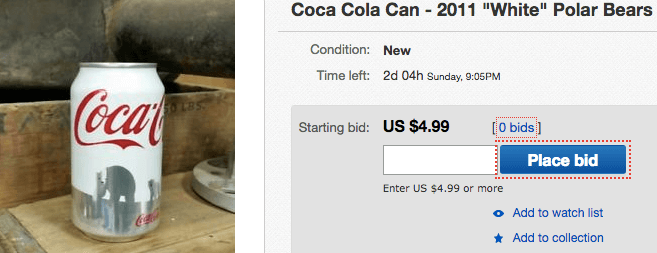
In 2011, Coca-Cola experienced a similar revolt. They introduced a limited edition white can to promote awareness for endangered polar bears.
Customers complained that the new recipe wasn’t sweet enough. Once again, Coca-Cola hadn’t changed the recipe, only the color of the can.
White Coca-Cola cans are now reserved for eBay nostalgia purchases.
Colors, shapes, image resolution, and positioning of images all impact how people view you.
This, in turn, impacts whether or not they become your customers.
In fact,
- If a person is given two websites to view, 66% of people choose the visually-appealing one versus a plain one.
- 38% of people say they won’t interact with a brand that doesn’t have an unattractive website
- 75% of initial brand perception can be attributed to how a site looks
The search engine Bing saw its revenues go up by $80 million when it changed its page to a specific color of blue that had tested well among focus groups.
How the site looks matters.
How To Instantly Improve The Aesthetics Of Your Site
Simplify each webpage. If it has unnecessary elements remove them. If the page is too “busy”, visitors aren’t sure where to focus.
Are there any repeated elements? View each page and remove any extemporaneous items.
Only use high-quality images and videos. Grainy, pixelized graphics aren’t good for your business.
Pay extra attention to “above the fold” elements.
This is the top 6 inches or so of your website. It’s the first thing people see when they load the page. Make it visual perfection.
If you need extras that aren’t as appealing, always put them toward the bottom of the page.
Certification badges, top clients, payment buttons, etc, typically go below the fold.
These are often irregular shapes and many colors that clash with your page.
Website Solutions For Small Business
Website solutions don’t have to be complicated. Sometimes it’s the little things like having a larger print that can transform the user experience.
And, sometimes, you need an expert who can implement website solutions that not only make your customers happy.
They increase your traffic and pad your bottom line.
Find out how we can help you grow your company. Contact us to schedule a consultation.
Other Website Marketing Resources
- Why You Should Invest in a Custom Website
- The Importance of a Website for Your Business Success
- 10 Different Website Styles That Will Match Your Business Type
- Top 10 Website Metrics to Measure to Improve Conversions
- The Ultimate Website Marketing Strategy to Increase Conversions [Step-by-Step Guide]
- How to Ruin Your Website in 5 Easy Steps
