What do all people have in common?
They need to eat and most of them love to do it!
But how do you get people to pick your restaurant over any other restaurant?
Maybe you have built a website for your business or maybe you’re still in the beginning stages of online marketing.
Did you know that there are certain components that are crucial when building a website for your restaurant?
Restaurant website design encompasses everything from SEO to sharing the story about your restaurant’s beginnings.
It’s photos, text and HTML that all work together to complete your design and help you gain customers.
We’re going to show you the keys to restaurant website design and some restaurants who have incredible websites!

Campaign Results: 72 Conversions, 2,672 Clicks, 146,736 Impressions and $12.19 Average Cost Per Conversion
11 Insider Tips and Tricks for Restaurant Website Design
1. Tell Your Story
Behind every restaurant there’s a story and people want to hear it. It makes you stand out from your competition and shows what makes you unique.
Show customers the ideas behind your restaurant and talk about how it got started.
Give some history if you have any! This makes your restaurant even more appealing especially if you have a good story.
The example below gives customers a feel for the restaurant before they even walk in the doors.
They tell website visitors what is served as well as describe the atmosphere so that patrons will know what they are walking into.
It’s nice to know the vibe of a restaurant before you go so that you can dress up or down and fit in with the crowd there.
If you are finding it difficult to eloquently tell your story let the professionals at LYFE Marketing craft a tasty description for you!
2. Style Elements
The font, colors and design of your site can all play into the vibe of your restaurant as well. A fancy font probably means that the restaurant is a bit nicer.
You can also give a more casual vibe by dressing down your site or adding elements that give insight to the feel of your restaurant.
Upbeet is a fast casual restaurant with a fun, young atmosphere. Their homepage clearly translates to this.
Their logo is casual and laid back and their text is thicker which adds to the casual vibe.
With a clean, minimalist design it may seem like they haven’t done much to “design” their site.
However, this is in line with their brand so it makes sense. When you hover over each option the photo changes and the white text turns pink.
This is a nice touch that adds a little something extra to the homepage of the site.
Per Se is a Michelin star restaurant that also uses minimalist design. Their site however is elegant and uses white space to create an upscale vibe.
Their use of thin fonts give the site visitor a sense that this restaurant is classy and dignified. The photos also tell the story of a fine dining experience.
Use white space, fonts and colors on your site that are in line with your restaurant’s vibe.
You can create an atmosphere on a web page to mimic your restaurant.
This way users have a sense of what they are about to experience before they even walk through your doors.
This is a way to get them excited and build up anticipation.

A strong appeal to ethos and a clear funnel of information was at the top of client’s wish list.
Having a navigation or menu bar is obviously a much needed element for every website.
There are several options when designing your navigation. You go with a classic top navigation bar with your options listed out.
There is also a vertical navigation bar that can either pop out when a button is clicked or stay static on the page.
Arbor restaurant creates a fun vibe with their vertical menu.
It makes the site interesting and fun! You can scroll down on the menu portion as well as the story.
They also make it easy to exit out of the story bar so that you can view the full photos.
You can get even more creative with your navigation if you’d like and have the sections advance as you…
…scroll and incorporate other elements like videos or parallax scrolling.
Parallax is when the background advances behind other elements on the page.
It gives a 3D effect and can spruce up your page often creating a fun design that highlights your photos
This restaurant uses parallax in a creative way. Their site has several blocks that interlock and scroll revealing new photos and information.
It’s a fun experience so you can only imagine what the restaurant will be like!
As always with navigation, make sure it is user friendly. Don’t make users work too hard to figure out how to scroll or click.
If your site visitors can’t figure out how to get to where they want to go they will often leave your site – which leads to high bounce rates and poor search engine visibility.
You definitely don’t want that!
Make sure all of your menus and submenus are linked.
Double and triple check this! If your menus are not appropriately linked in your navigation bar this can be another cause for user frustration.
Restaurant Website Design Tip: Have navigation at the bottom of your site as well as the top.
It’s helpful for the user when they scroll all the way to the bottom and then want to go on to another page.
If you don’t like the idea of bottom navigation consider a sticky header!
This type of header will stay as you scroll on the page so that your website visitors have your menu bar wherever they go on the page.
4. Instagram feed + Photos
People eat with their eyes so of course it’s important to have photos.
Linking your Instagram with your website is an easy way to showcase what you are posting.
It will automatically populate with your newest photos that you post on the gram.
This allows potential customers to get a sneak peak of your food, so be certain that you are always posting quality photos.
If you have a WordPress site there are tons of different plugins you can install that have various styles and sizes.
Find one that suits you and your branding. If you don’t have a WordPress site, we highly suggest having one custom designed for your brand.
We have a team on staff that can do it for you!
Grub Burger Bar is a casual restaurant that displays their Instagram feed with four photos at a time.
Each photo is linked so that the viewer can view that photo on Instagram.
The Iberian Pig restaurant shows their Instagram feed a little differently than Grub.
They have also chosen to show Instagram captions when the user hovers over each photo.
In addition to an Instagram feed you need to have high quality, beautiful photos of the food you serve.
Imagine having an online clothing store without any photos.
How are customers supposed to know what the products look like? The same is true for a restaurant.
This restaurant not only has amazing photos of their food on their website but since they serve unique dishes they also have…
…descriptions when users hover over the photos.
This is a restaurant website design technique that can take your site to the next level.
Users are able to view the photos without distraction and then hover over them to read the description of what each dish is.
It is especially helpful for potential customers to have throughout descriptions of your food if it is something that is out of the ordinary.
It’s not enough for the photos to just look pretty, sometimes you need additional text to explain your dishes.
For restaurant website design, full width header photos can take your homepage to the next level.
Photos that stretch the width of your page are inviting and allow site visitors to see detail and invite them to explore further.
Think about which photos you are placing where. You can often lead customers into the rest of your site.
The placement of these pasta noodles makes you want to scroll to find out more.
Pro Tip: In restaurant website design photos are of utmost importance, but don’t just focus on the visual aspects.
Make sure your site is functional and has great user experience.
If your customers can’t navigate and find what they are looking for they may become frustrated and leave your website.

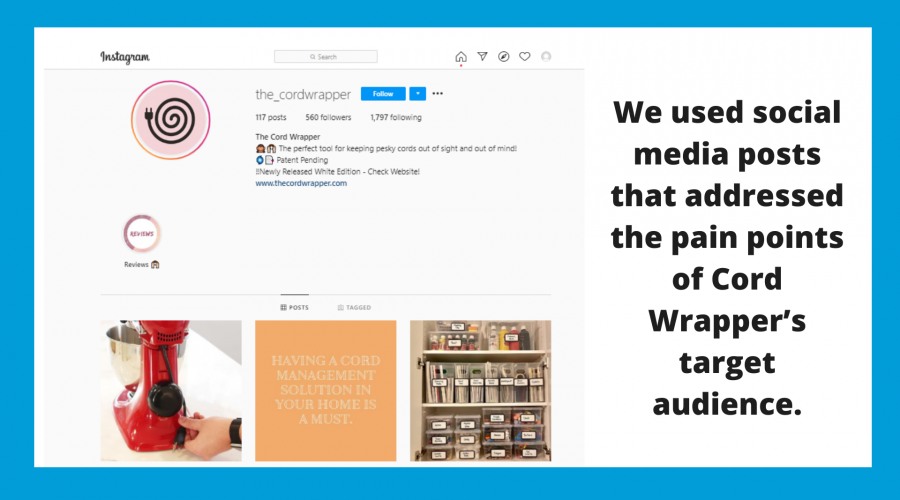
We use social media ads and posts that addressed the pain points of target audience.
5. Incorporate Video
Give your site visitors more to admire. Consider using video in your restaurant website design.
You can use this in your header to grab the attention of potential customers or to show the inner workings of your restaurant.
Le Laurent, a restaurant in Paris uses video to show off their dining room experience.
By moving your mouse around, you can control the video. This is a fun feature that guests may spend some time playing around with on their website.
Video can give your customers additional entertainment and hold their attention for longer than a photo can.
Be careful when using video in restaurant website design.
You don’t want to use so much video that your users become motion sick. Find a balance and use video where it makes sense!
6. Use graphics
In restaurant website design graphics can help show processes, how to eat certain cuisines, or how food is made.
You can also use graphics to enhance the style of your site or menu.
If you make all of your dishes from scratch recreate that feeling from a design standpoint by using hand drawn graphics.
If your restaurant is a new concept, then graphics can work wonders!
Even if it’s simple, showing people how your restaurant works can put customers at ease.
Michi Ramen shows their website visitors a simple graphic on their homepage of how to build their bowl of ramen.
This is a stylistic element that adds character and can make your page a little more exciting.
How many times have you found a restaurant that you really want to try but they don’t have a menu with prices online?
This is frustrating. You don’t want customers to be frustrated before they even walk into your restaurant.
Or give them a reason to not even want to walk into your restaurant.
Make sure that your menu looks nice and is designed.
Text on a page isn’t appealing, especially if you are a high end restaurant. Simple, clean design is the best type of design for your menu.
It shouldn’t be hard to read or busy, but it should have some elements of good restaurant website design.
Use fonts that reflect your branding, graphics or simple drawings.
And make sure you are not using a light font on a dark background. Learn more visual graphic design tips from us.
Include photos in your online menu.
If potential customers can see photos of your food alongside your menu, it can make them even more likely to come in and try out your restaurant.
If you have a seasonal menu or your menu changes every day post it on your social media accounts and direct website visitors to your social pages.
That way you don’t have to update your online menu every time it changes and you can engage with users on social media.
8. Contact page
This is important for any and every business, but it’s especially important for restaurants to display their information.
You should have a contact page complete with your hours, physical address, email address and phone number.
Include a way to make reservations if you take them.
When you are building your site make a note that it’s important to have all of your information consistent across your websites as well as…
…any and all platforms you are using.
This includes social sites as well as sites like Yelp and especially Google My Business.
Your Google My Business tells customers everything they need to know before they visit your restaurant.
It tells them when you are open, your address, and it also shows reviews.
This can help potential customers decide whether or not they want to visit your restaurant.
Pro Tip: Get your site listed as many places as you can!
You can use sites like Yext to get listed in online directories so that users can easily find your business.
However, it’s crucial that your restaurant name is the same across all platforms! This can confuse your customers as well as search engines.
Pierre’s is a fast casual pizza chain, but they are not consistent with their information.
Pierre’s Eatery and Pierre’s Pizza may be in two different places but they are the same restaurant and should have the same name.
Google now thinks that these are two different restaurants which can lead customers to think so too.
9. Blog section
People want to know about the food you are making, where it comes from, your chefs and their skills, as well as your restaurant’s unique attributes.
A blog is a great place to tell them about all of these things and more! Your blog design should be clean and easy to digest.
Consider having a sidebar with additional blogs that your readers might enjoy.
If you don’t know what to write about you can hire of our expert restaurant bloggers to do the thinking for you!
Or consider explaining how you cook and serve your food.
If you own an Italian restaurant and you hand make pasta each day, blog about it!
Tell customers about your process and where your ingredients come from. You could even write about the different shapes of pasta or include a recipe.
There are so many possibilities to educate people about your restaurant.
A blog is not only helpful to your customers but also helpful for SEO. You can write blogs to rank for specific keywords.
Search engines will pick up on this – and if you do it right, you can rank on the first page of search results.
You may think that running a blog and a restaurant at the same time is difficult and you would be correct.
Get professional help, take the pressure off, and focus on running your restaurant.

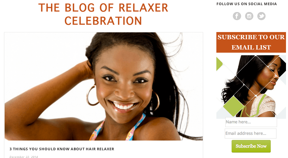
We designed this lead generating blog to our client.
10. SEO
SEO or search engine optimization is important no matter what your business is.
But for a restaurant, local SEO is what you will want to pay attention to.
Most people, when they are looking for a restaurant, want somewhere that is close to their current location which is why focusing on local SEO is a must.
Your goal is to show up in the local pack which shows the top three results.
These three results are the ones that are receiving the most traffic and probably the most customers.
When planning your restaurant website design you will want to be mindful of front end and back end elements that will affect your SEO.
Designing your navigation to be user friendly will help customers stay on your page for longer periods of time.
This is called dwell time. The more dwell time the more legitimate your site will look to search engines which means that they will rank your site higher.
Make sure your menu is easy to find, use engaging photos or even a photo gallery or give your site visitors fun graphics to enjoy.
If your site is unappealing it’s likely that you will have high bounce rates.
A page bounce is when someone clicks on your site expecting to find a beautifully designed site with great user experience.
When users find websites that are a mess, they click the back button creating a bounce which does not look good to search engines like Google.
The good news is you can track your bounce rate with Google Analytics.
If it’s high you may want to take a second look at your website. If you need help investigating further let us know!
When you are designing your site for search engines there are a few things you will want to keep in mind.
Keywords like “best restaurant” aren’t going to cut it especially if you are a smaller business.
You need to go for words that are targeted so keyword research is a must.
You may have great photos of your food but search engines can’t physically see them so make sure that…
…you are writing descriptions (also known as image alt tags) for every single one of your photos.
You’ll also need to write title and meta descriptions for search engines and make sure that you have an H1 tag on every page.
You will need to design these to be informative and convincing so that people will want to click on your pages!
Check out the checklist of our SEO best practices to get you started!
 We’ve generated almost 200 leads for their business!
11. Restaurant Website Design for Mobile
How many times have you used your phone to find a restaurant? It’s convenient, quick,and you can do it on the go.
Since there are so many potential customers searching on their phones your website needs to be optimized and designed for mobile.
This includes menus, navigation and any other elements on your site that might be affected by a smaller screen.
It’s difficult to zoom in and out on a menu when you are trying to read it on a mobile device especially if your menu is in a PDF format.
Instead type it out and format it. Add some design elements to give your menu some character and then double check it on every device!
Don’t assume that your site is going to look perfect on tablets, phones and computers. There’s a good chance you may need to do some tweaking.
Bar Mercado has a great mobile site. Their menu is easy to read and compatible with every device it is viewed on.
Instead of clicking on a PDF to view, it is a page on their site with text that is easy to read and…
…small designed titles that add character and help tell their brand story.
Notice that it’s not overwhelming but still aesthetically pleasing.
A high quality restaurant should have high-quality restaurant website design.
If your website lacks good photos and design elements it will deter people from coming in to try your food.
It doesn’t take long for people to form an opinion.
Don’t sacrifice a great restaurant website design. It could hurt your business!
You want your website to be captivating and make your potential customer’s mouths water.
Give them a taste of your restaurant’s atmosphere and make crave your food before they even try it.
Designing a website for your restaurant can take a lot of time out of your day and if you lack experience, it can be incredibly difficult to get right.
We offer full-service restaurant website design where you will work with our…
…team of professionals to develop a beautiful, custom site that will bring those customers through your doors!
What are you waiting for? Contact us today!
Other Restaurant Resources
- 13 Creative Restaurant Marketing Ideas That Will Bring in More Customers
- 11 Best Restaurant Websites: LYFE Agency Awards
- Digital Marketing for Restaurants: A Recipe for Success
- Surprise Your Customers with 10 Fun Restaurant Promotion Ideas
- 6 Easy Ways to Use Facebook Marketing for Restaurants
- How To Acquire More Diners With Restaurant Facebook Ads
- 13 Features All Successful Websites for Restaurants Should Have
- Social Media Marketing for Restaurants: The Basics
- 4 Key Ingredients For A Successful Restaurant Marketing Strategy
- 7 Restaurant Social Media Ideas to Drive More Customers


