Gathering graphic design ideas for your business might seem overwhelming.
There’s so much good design out there but there’s also a lot of bad design.
How do you sift through it all and find graphic design ideas that will work for your business’s logo, website, social media accounts and email marketing campaigns?
We’re about to give you some insider tips and tricks that will make your life much easier when it comes to graphic design ideas for your brand!

Lead generation and readability are the client’s most important.
Logo Graphic Design Ideas
You may have neglected creating a logo for your business or maybe you have one but you’re looking for an upgrade.
Whatever the reason, you are in need of some graphic design help. We’re here to give you some graphic design ideas and inspiration from the pros.
Before we get started with graphic design ideas for your logo, let’s go through some basic graphic design tips for designing your logo.
-
Start with a black and white design. This will allow you to focus on the details.
If you can grab someone’s attention with black and white, then imagine what adding color will do!
-
You will want to create your logo so that there are several different versions of it.
If you are using full color that’s great, but you will also need your logo on a grayscale.
For example, if you put your dark logo in the footer of your website which happens to be black, you will need a completely white version of your logo.
-
Think about what your brand stands for and what you want to communicate with your audience.
This should come through in your logo. If it doesn’t, it’s back to square one.
-
Choose your font wisely. A serif font gives a professional and sophisticated feel whereas a sans-serif font is more playful.
Mixing fonts can be fun too, but we recommend using a maximum of two fonts.
-
Make your logo memorable! Brand recognition is key when marketing your products or services and it all starts with your logo.
Brands put their logos on websites, social media pages, and promotional products.
Since your logo will literally go everywhere, make sure that people remember it.
-
Sometimes the best logo is simple. If you are trying to incorporate color, graphics, fonts and objects, take a step back and reevaluate.
Decide what is most important to your brand. You don’t want your logo to be too busy or distract from your purpose.
Letter Based Logos
There are more than 26 variations to a single letter logo design.
You can experiment with different fonts, adding color and shapes, shadows, lines and more!
Logos that only have a single letter as their main component can be easily recognized and become famous over time.
Take the McDonald’s M for example.
It’s more than just a letter. It stands for the iconic golden arches that were modeled after the restaurant architecture.
If you were to show someone today a golden letter M they would more than likely associate it with the McDonald’s brand.
If you’d like to associate your business with a single letter, ensure that it makes sense for your brand.
Your letter doesn’t have to be plain, you can add other elements to make it more appealing.
Take this logo for example. Its main letter is a B but includes an arrow that shows movement and makes the logo more interesting.
Pro Tip: When creating a letter based logo think about the goals of your business and what feelings you want to evoke from your customers when they think about your company.
Wordmarks – Text Based Logos
Logos that just include text are incredibly popular. Did you know Coca-Cola’s logo is just a fancy font that was hand drawn?
By now it has turned into a famous script that has had a few tweaks over the years but has stayed true to the classic font that people recognize worldwide.
For this type of logo you can create your own text or use one of the millions of possibilities that other people have created.
If you think that there isn’t much you can do to make your text logo stand out, think again.
You can vary the colors, fonts and sizes of your letters or use different font sizes to make certain words stand out. Add in color to separate your text or make a color block.
If all else fails keep it simple. Take Google for example.
Their logo is simply text with various iconic colors.
One thing you can learn from this logo design is that it’s okay to make updates as design trends change.
If Google was still using their logo from 1997, you can bet the company wouldn’t be as popular as it is today.
Distorting Text
You do not have to have a separate graphic to have a logo, you can insert it right into your text.
Even adding the smallest shape to your text can create a new shape or graphic.
Look at the logo below. Without the addition of a small triangle below the i and l in pencil, it’s just text.
But adding this small element of a triangle creates the shape of a pencil within the word.
This logo is simple and colorless, but you can bet your customers will remember it!
The slightest change to a letter can add a graphic element to your otherwise plain text.
Check out some more graphic design ideas with distorted text.
The addition of this “bite” out of the letter B creates a bread like shape that combines the graphic with the text. It also transitions seamlessly into the font.
You can even move your letters around to make your logo more visually interesting.
Simple changes to your fonts can add so much and aid in engaging your potential customers. This designer has taken the word literally in this logo.
The letter A appears to be snapping in half with the rest of the word falling off.
Integrating Two Objects
If you want to add a graphic to your text, integrating objects is a fun and creative way to do so.
LoveClip has a uncomplicated logo design that uses simple text with a graphic. Integrating two objects can be easy, but can sometimes pose a problem.
If the two objects you are using seamlessly fit together like this, then go for it!
If it’s something more complex you may want to have a professional graphic designer help you design your logo.
Abstract Logo Design
If you don’t want people to know exactly what your company stands for, use an abstract logo.
This is a good way to capture attention and engage potential customers!
Incorporating curiosity into your logo will automatically make people want to find out more.
This logo may be abstract but it works really well for this architecture company!
It gives the impression of a house, but the lines create an abstract shape giving the impression that the designs from this architect business are top-notch.
Abstract logo design allows you to be as creative as you want, incorporate many different elements and showcase your brand’s personality in a unique way!
Of course, your logo design does not have to be limited to these few types of graphic design ideas.
Let your imagination run free! A logo should define your company, tell a story, and most importantly increase your brand recognition.
Social media is a content-driven platform but how do you get people to pause long enough to listen to what you have to say and engage with your content?
Create graphics to go along with your photos and other content you are posting. It’s beneficial to mix it up to keep your followers on their toes.
Here are some quick tips for social media graphic design.
-
Use your logo
You already know how important your logo is.
In order for your brand to be recognized it needs to be everywhere and this means you need to include it on your social media graphics!
Make sure that it stands out against your graphics. You wouldn’t want to put a colorful logo on top of a colorful graphic.
This is another reason why you need that black and white logo you created!
-
Stay simple
Your designs should be eye-catching but to ensure that they don’t distract from your content.
Graphic design is meant to enhance not take away from the content.
-
Use text, colors and simple shapes to get started
If you don’t have graphic design experience your social media posts can still be enhanced with fonts and colors.
If you feel like you don’t have an eye for design, our graphic designers would love to help you get started!
Ready for some social media graphic design ideas to get you inspired?
Quote graphics are great for getting a point across while also being visually engaging.
Choose an inspirational quote or a quote from one of your blogs to promote positivity or engage users.
This is a fairly simple graphic that includes a quote but grabs the users attention while also showing the brand’s personality.
Pull data or statistics from your research that makes sense for your company.
If you use a captivating statistic as a graphic, go on to explain more in your caption.
Putting this text over a photo leads followers in to continuing to read. Vary your colors so that it accentuates important words.
Create graphics for your events. Instead of just posting photos with captions try creating an engaging graphic to describe your event.
A graphic will ensure that your followers stop long enough to absorb the information.
Social media ads are crucial to growing your business.
If you don’t have experience with social media advertising it can be difficult to figure out what type of posts work for you.
You should be creating graphics for your social media ads. Captions alone will not engage your potential customers.
Adding graphic design into the mix on your social media accounts will spruce up your content as well as your feed on sites like Facebook and Instagram.
Pro Tip: Test social media graphics to determine which one creates the most engagement.
Don’t be afraid to try new things and step out of your comfort zone!
What other graphic design ideas do you have for social media to enhance your message?

Social Media Post Sample
Website Graphic Design Ideas
We all know that your website is where most of the magic happens.
This where the majority of your most important content is kept and where customers can contact you and make purchases.
Your website will more than likely display several types of…
…graphic designs including your logo, icons, charts, menus if you own a restaurant or other stylistic elements.
Effective website design includes graphic design elements like typography, illustration and photography.
Use typography to show hierarchy on your website. Vary your fonts to differentiate between titles and body text.
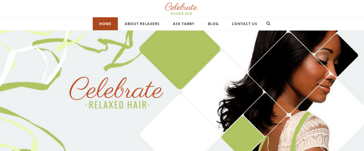
This site shows which text is most important but using larger font size as well as different fonts to differentiate between sections on their page.
Illustrations can enhance your web pages, break up elements and make your site stand out against your competitors.
Maybe you want animations on your website or graphics that will draw in your customers.
The entire header on this site below is just an illustration. Certain parts move on the screen to entice younger viewers.
Photography may not seem like it should fall under the category of graphic design.
But combining graphic design with photos can take your content to the next level.
Photos can help break up space and create a pattern or layout for your website.
This website uses photos to break up the page and create a block layout. You could even design an entire web page based around photos.

Website Graphic Design Samples
Email Graphic Design Ideas
Did you recently send out an email that was lackluster? Maybe you need something to spice things up!
Or maybe you’re reading this because you’re looking for a change.
This is where designing graphics for your emails comes in handy.
It’s a simple addition that can make a world of difference in driving engagement and click through rates.
Add movement to your emails. When your subscribers open your email you want them to spend some time learning about your sale, company or content.
Use animations or gifs to catch your subscriber’s eye and hold their attention.
Add layers and texture with patterns and shapes to make your text pop.
Keep that same color scheme or pattern going throughout to tie your design together like this email!
Pro Tip: Use whitespace to break up elements in your website and emails.
It doesn’t matter if your email is text based or contains mostly photos, your elements need room to breathe.
Whitespace is the space between elements that are essentially empty.
It isn’t always white. You can use colors to break up elements as well.
There are so many other graphic design ideas for your email marketing campaign that you can use to draw attention to…
…certain elements or text that you send in your emails.
The point of email marketing is to grab the attention of your subscribers and make them take action!
Need help with your email design? Let our email marketing team know!
These are only a few graphic design ideas for your brand so don’t feel limited!
Check out what other companies are doing, look at design trends and get inspired.
Designing graphics for your business is important and should be taken seriously, but it’s also a chance to get creative.
Have ideas that you want to be brought to life? We are a graphic design agency that can help you take your designs to the next level!
Contact us today to bring your design ideas to LYFE!
Other Graphic Design Resources
- Design Graphics That Sell Your Product
- No More Boring Graphics: Add Dimension With This Visual Design Trick
- 7 Logo Design Types For Your Business
- Social Media Graphics Ideas: Upgrade Your Social Media Visuals Today
- Graphic Design Services: Using Graphic Design to Grow Your Business
- Social Media Ad Graphics Do’s and Don’ts + Some Tips
- What You Need to Make Quality Business Graphics


