Just because your graphics look great, that doesn’t mean your products are going to sell well.
This means your graphic must be both aesthetic enough to catch someone’s eye, and effective enough that it communicates and convinces your audience to make that purchase order.
The one on the left is great but won’t catch as much attention as the graphic on the right.
So in this post, we’re going to make sure your digital marketing graphics are designed to sell, and the best part? You can do this in 4 easy steps.
But first, let’s discuss what makes a graphic effective.
What Effective Marketing Graphics That Sell Look Like
Instead of giving you a text-based answer, we’re better off showing you samples.
This ad objectively doesn’t look bad but it seems like it isn’t exciting enough to convince us to engage with the brand, let alone buy anything.

Why is that so? Because it looks too flat and one-dimensional. Most importantly, it won’t likely stand out when viewed through social media where we see tons of ads in a day.
So how do we improve our odds of reaching and leaving a lasting visual impression on our audience? Here are 4 easy steps to do this.
4 Steps To Design Marketing Graphics That Sell
Step #1: Highlight your hero
The goal is to have the graphic lead your audience’s eye to the focal point of your visual, which in this case is our product.
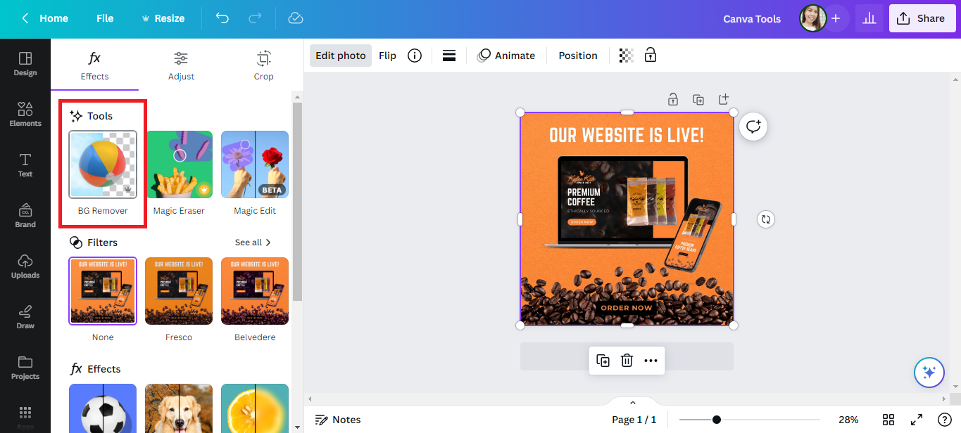
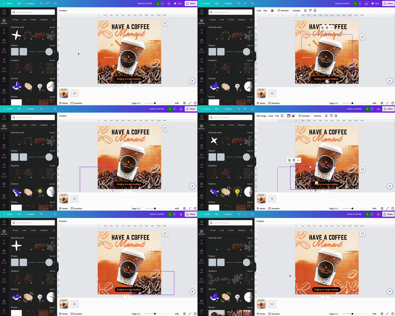
So first off, let’s isolate our centerpiece.
There are many ways to do this but for this guide. let’s use Canva to remove the background. After that, color-correct the product image to make it more vibrant.

Step #2: Add a typographic headline
At this point, you should have your branding guide. If you don’t know how to create one, here’s our tutorial on how to make a visual branding guide for your business.
But let’s say you already have one, you should have designated brand fonts or typography that compliments your branding.

Use a combination of your accent font and sub-headline font to deliver an eye-catching message to your audience. Here are some more typography tips that you can read next.
Step #3: Boldly introduce your brand colors
Your brand colors are what your audience will heavily associate your brand with. Forget about being modest, make sure your colors are visible.
Step #4: Abide by ”less is more”
Here’s a principle that you can apply to your graphics for marketing that will never go out of trend. Less is more.
When you can, always declutter. There is absolutely no need for elements that clash with or distract the eye from what your audience needs to see.
With that in mind, these three elements can go.

Instead, let’s add something that will help highlight our main image. For this guide, let’s add a platform below our product.

And just like that, we’ve upgraded our graphic from this…

to this.

These simple rules can easily level up your visuals from simple graphics to graphics that sell.
But if you want to work with a creative marketing agency to design your marketing visuals, we’re here to help. Reach out to us today to get started!
Other Graphic Design Resources
- No More Boring Graphics: Add Dimension With This Visual Design Trick
- Best Graphic Design Ideas to Take Your Brand to the Next Level
- 7 Logo Design Types For Your Business
- Social Media Graphics Ideas: Upgrade Your Social Media Visuals Today
- Graphic Design Services: Using Graphic Design to Grow Your Business
- Social Media Ad Graphics Do’s and Don’ts + Some Tips
- What You Need to Make Quality Business Graphics


