Have you ever landed on a website that. Blew. Your. Mind?
Maybe it’s a stunning image, copy that grabs your attention and draws you in, or something unique that you’ve never seen before.
Whatever the case, cool website design is essential to engage your audience and hold their attention long enough so that…
…you can get your point across and make that sale.
Let’s define “cool” in terms of website design.
We all know that when someone references the word “cool” it means attractive or sophisticated, a step above the rest.
Cool website design will make your potential customers do a double-take.
It keeps them engaged, adds value, and presents a certain wow factor. Sure you can use a template, but don’t you want your business to stand out?
There are multiple elements that you can add to your site to ensure that your customers stay engaged and ultimately buy your product or service.
Are you ready to take your website to the next level?
Cool website design needs to do several things for your audience.
First, it must be captivating enough to keep your customer on your webpage page.
If you fail to capture their attention quickly, they will navigate away from your site, often to a competitor’s site and you will lose sales.
Second, the user experience must be exceptional. Users will leave your site if they don’t know what to do or how to navigate.
Too much text and you risk looking spammy. Not enough text and your SEO might take a hit.
Third, your website has to have that wow factor. This can be something that no other website out in the www has ever done.
Or it can be something that other sites do every day. You just have to do it better than the competition. But how?
What do you need to consider when creating to ensure you not only have a really cool website design but also content that is valuable to your visitors?
What elements can make or break your site? How do you use them in a way that is aesthetically pleasing?
Why should you even care about having a cool website design?
Certain elements will increase your website’s usability, making it easier for your customers to learn about your product or service.
Keep them engaged with your content and ultimately lead to them making a purchase.
Now let’s dig into some really cool website design elements.
9 Elements of Cool Website Design For Your Business
1. User experience
What is it? It is crucial that your website visitors have a great user experience.
With a cool website design, you’ll also ensure that they have a unique one.
User experience encompasses all interactions the user has with your brand or products.
It is how someone navigates a website and how they experience it.
Your job is to help your customers complete a task with as little effort as possible on their end.
Why should you want it? Without an easily navigable website, your users will be lost.
A poor user experience can greatly decrease your leads which can ultimately decrease your sales.
Potential customers will leave your site if they cannot quickly and easily access the information they are looking for.
How does it create value for a user? As a business, you want to provide your customers with the best possible experience.
You want every interaction they have with your brand or product to be exceptional.
If your website is the first interaction your customer has with your brand, and it’s uninviting and difficult to use.
Your customers are going to find someone else. Make sure your design decisions are meaningful.
Example: Duolingo has a simple interface that makes it easy for users to get started learning a language in four clicks.
There is a clear call to action for users to get started.
They then select what language they want to learn, set a goal and choose between starting with the basics or taking a placement test.
Duolingo keeps their website design clean which makes for an enjoyable user experience.

What is it? Navigation is needed on every website. In case you’re brand new to the web design world, navigation is essentially your menu bar.
It’s how you choose to lead customers around your site.
It is so important that your navigation is intuitive. If you have poor navigation it can have adverse effects on your traffic and conversions.
If a user can’t find what they’re looking for, chances are high that they will exit your site and find another business to purchase from.
Why should you want it? If you have to have navigation, make sure you do it better than your competitors.
A menu bar is obviously a must but there are so many opportunities to stand out. Make your navigation an engaging experience for your customers.
How does it create value for a user? The goal for you as a business owner is to sell your product or service.
Yes it’s important to have a cool website design that engages your users but that means nothing if they can’t navigate your site.
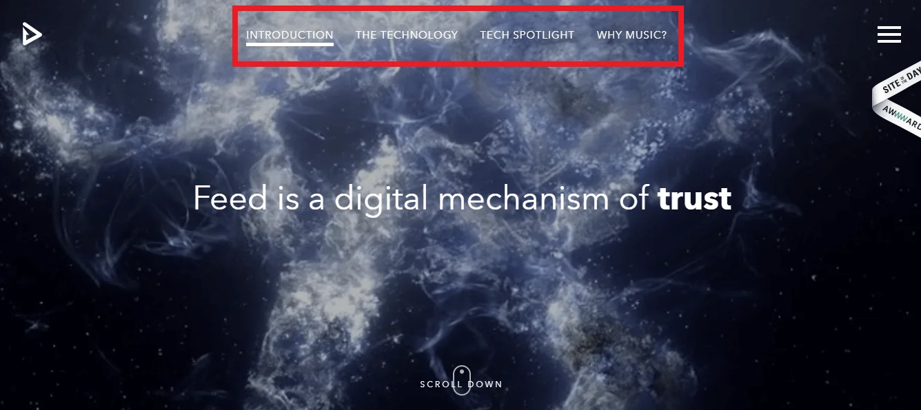
Example: Feed Music’s site is an experience. Their navigation is clever and engages users.
As the user scrolls they are guided through the site effortlessly. All they have to do is scroll down and they are moved through the site.
3. Whitespace
What is it? Whitespace doesn’t necessarily mean “white.”
It is the use of any negative space on your site to emphasize elements, break up the page or give your customer’s eye room to breathe.
There are two types of whitespace; micro and macro.
Micro whitespace is the space you typically see between text block elements. It may seem insignificant but imagine if your site had no negative space.
It would look like one continuous, overwhelming text block. Macro whitespace uses much more negative space to break up elements.
It can be tricky to properly utilize macro whitespace, but it gives an attractive, clean look and feel to your site.
Why should you want it?
You don’t want to overwhelm your site visitors with tons of content blocks. Each element should stand out and have space.
White space can draw attention to certain elements or highlight images or text. Whitespace is your friend, don’t be afraid to use it.
How does it create value for a user?
White space can…
-
Help with navigation – when a customer lands on your site you want them to be able to understand the content and do so quickly and effortlessly.
You may feel the need to fill the empty space. But this space allows your customers to digest the content and have a better overall user experience.
-
Highlight your CTA – what’s the point of your website if customers can’t figure out how to purchase your product or service?
Whitespace can help highlight your call to action.
-
Create balance on your site – A whitespace is a wonderful tool that can create harmony on your page.
Don’t overcrowd your site but also make sure you have enough content so your user knows what your brand is all about.
In short, utilize whitespace so that your elements will stand out, your message will be clear and your customers will easily understand your brand.
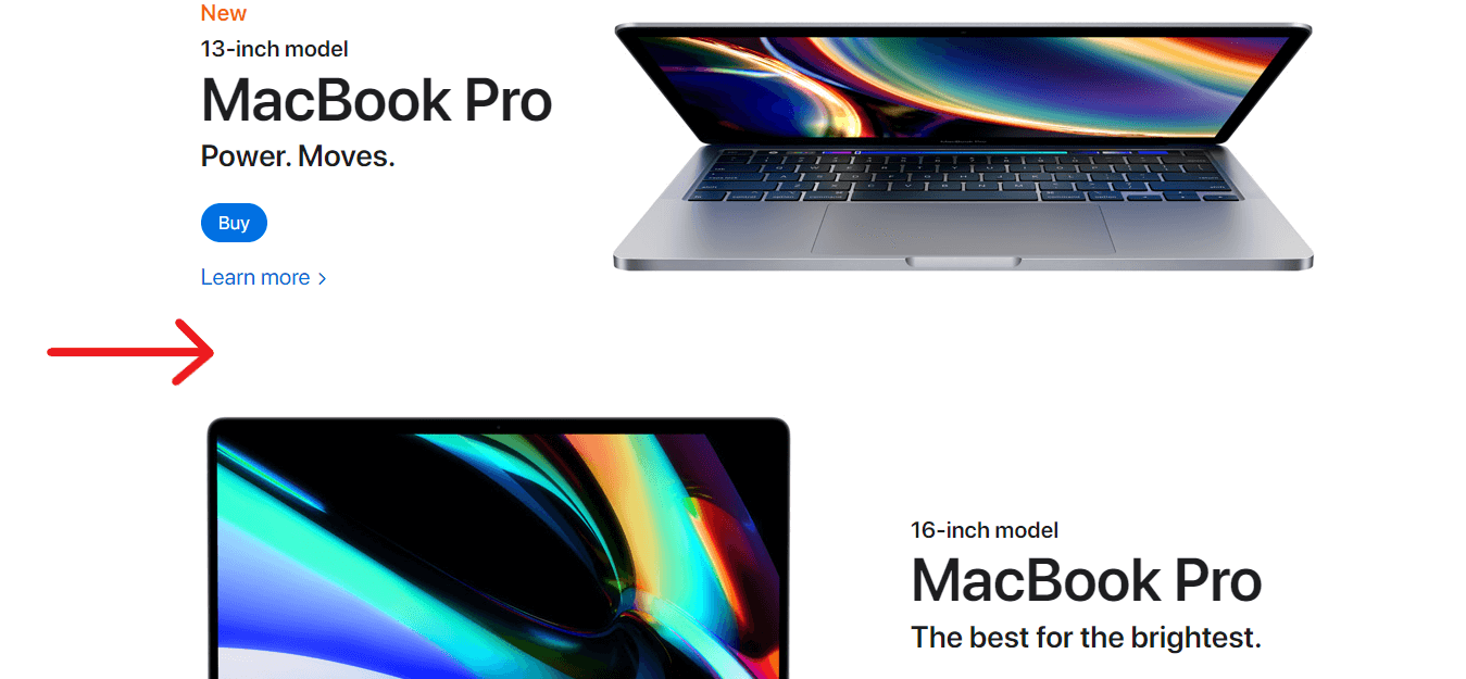
Example: Apple’s Macbook site is simple yet captivating. Not only is there really cool website design but a great use of whitespace.
Each element stands out and the negative space gives the user time to soak it all in.
4. Call To Action
What is it? A call to action, also known as CTA, is an element, button, or word that helps you generate leads and get conversions.
You’re asking customers to take action and buy your product, sign up for your newsletter, or make an appointment or try your product for free.
Make sure your CTA is above the fold so as soon as people land on your site they are able to see it without having to scroll.
It also needs to be visually striking and stand out against other elements on your site (here’s where whitespace comes in handy).
Why should you want it? This is one of the most effective techniques used to increase conversions.
Do you really expect users to sign up for your newsletter or try your product if you don’t put a button in front of their face as soon as they land on your site?
Calls to action help persuade potential customers to take action on your site.
How does it create value for a user? Similar to navigation, a call to action provides users with direction on your site.
When someone lands on your webpage they expect to be able to quickly find what they are looking for.
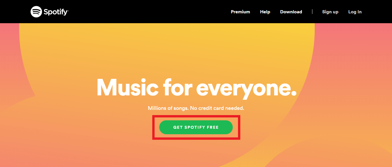
Example: Spotify has only one CTA on their site and has the power word “free”.
The text above these two CTA’s “Music for everyone.” is bold, catchy and although simple, they have a pretty cool website design.
5. Quality Images
What is it? Quality images are high resolution, “non stocky”, clean photos.
Stock photos have a tendency to be cheesy and bring a staged feeling to your site.
There are cases when stock photos are great – you just have to choose which ones you use carefully.
Do not have blurry, low-quality images on your website.
It is unappealing and can make you seem unprofessional. Take good photos or if you can’t, hire someone that can.
Photography is not cheap, but in the long run, it’s worth it and only enhances your cool website design.
Why should you want it? Photos can capture the essence of your brand, show off your product, and help make your website look incredible.
A big bold header image can make a statement and really showcase your product or service.
Photos that are clean, engaging, and creative will entice users to learn more about your product or service.
How does it create value for a user? Professional, high-quality images that show off your product or brand can help build trust.
If your product looks legit, potential customers will perceive your brand as legit.
Example – Falvé is a men’s clothing brand based in New Zealand.
Their homepage is comprised of high quality photos that showcase their products but are also intriguing.
From these photos their customers can get a feel for the brand.
6. Responsive/mobile-friendly
What is it? Mobile phones have taken over and that is precisely why mobile-friendly or responsive mobile website design is so important.
A responsive website looks good on every screen size from a 27-inch desktop monitor to a 5.5-inch smartphone.
With all of the technology today it’s impossible to pinpoint which device your customers will be using.
But there’s a good chance that they will be looking at your website on a mobile device.
In 2017, mobile devices accounted for nearly 50% of all website page views worldwide.
Responsive web design ensures that users see a beautifully designed site no matter what device they are using.
Why should you want it? Your website should respond to the user’s behavior whether it is on a smartphone, tablet, or desktop.
Don’t miss an opportunity for a sale because your website doesn’t look good across all platforms.
How does it create value for a user? Imagine that you are surfing the web on your phone.
It’s compact convenient and you can take your mobile device anywhere.
You pull up your favorite website to make a purchase and have to zoom in and out to navigate.
This is a nuisance and most of the time, your customers will not switch to a desktop device.
They’ll stop looking at your product altogether. You want your customers to be able to easily navigate your site no matter what.
You want it to look nice on every device. Make it effortless for them to complete their purchase or learn about your brand.
Example: Food Sense is a website dedicated to plant-based eating. The desktop version has a side menu bar as well as a horizontal menu bar.
When the user views this site on a mobile device, the information transitions effortlessly.
It’s not too busy and still manages to include all pertinent information.
7. Parallax scrolling
What is it? You’re probably used to seeing this but if you’re a novice, you might not know exactly what it is or how it works.
One of the best components of cool web design is parallax scrolling.
This is used to create depth and allows images to seem as if they are leaping out of your computer screen.
Parallax scrolling uses multiple backgrounds which are set to scroll at different speeds to create this 3D sensation.
There are templates that utilize this feature but if you’re able to code your own parallax site, you’ll knock your competitors out of the park.
Why should you want it? In short, aesthetic. It shows your potential clients or customers that you’re willing to go the extra mile.
How does it create value for a user? Parallax scrolling adds that wow factor.
When a user lands on your website and begins scrolling they probably won’t expect a 3D effect.
Adding this cool website design element will almost guarantee that a user will stay on your page and interact with your content.
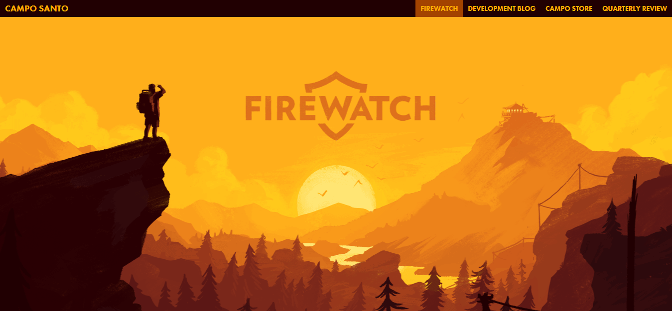
Example: Firewatch Game and Aquatilis Expedition both have incredible parallax scrolling on their sites.
They both use this element in different ways but still engage the user and keep them scrolling.
Firewatch utilizes several backgrounds layered on top of each other to create a 3D effect.
Aquatilis has creatures that pop off of the page every now and then to capture the users attention.
8. Email Integrations
What is it? Everybody has it and everybody is constantly checking it. You guessed it, email.
Whether it’s Gmail, Outlook, or AOL (if you’re still stuck in the dark ages), almost every person has an email account.
Integrating email into your site is a must if you are selling a product or service.
There needs to be a way for users who visit your site to sign up to receive emails from you!
This is the first step in building your email marketing list and executing an effective email marketing strategy.
Why should you want it? Sure someone can search for your product but they have to make that decision on their own.
If you have their email, you have the power.
8 out of 10 customers who signed up to receive emails from a business actually made a purchase based on the content they received within the first six months.
As a business owner, you want a good return on your investment or email marketing ROI. You want conversions.
How does it create value for a user? Don’t disturb your site visitors, ask for their emails in a polite and creative way.
If someone wants to learn more about your brand, there is a good chance they will sign up to receive emails from you.
This is your chance to provide them will valuable content and maybe a coupon every now and then.
Example – Knockaround, a sunglasses brand based in California, tends to change up its email pop-ups from time to time.
This one is fun, interactive and offers the customer a discount if they subscribe!
Once the customer clicks the “Click To Win” button, the characters act like a slot machine and reward the customer with a discount if the shades land on the shark.
This is a fun way to interact with potential customers, keep them engaged with your brand and if you do it right can make for some pretty cool website design.
9. Telling Your Brand Story
What is it?
Telling a story with your brand is just that.
It’s an in-depth look at your company, product, or service that gives customers a comprehensive and thoughtful picture of your brand.
It can evoke emotion in your users, engage them and help you to stand out from the competition.
Why should you want it?
You can do incredible things with cool website design but why would you want to tell a story?
This is an easy way to engage with your customers.
Don’t just tell them your brand story, show them. Use imagery, sound, video, text.
All of these elements can come together in a journalistic way to convey the message that your brand is the best and here’s why they should purchase from you.
How does it create value for a user?
This is something unique that not only tells a customer that they should buy your product or service but why they should buy.
If you can tell the story behind your brand or how it came to be, do it. This is a unique approach that gives customers a solid reason to purchase.
If you can do it right, your audience will easily become ambassadors to your brand which are basically free salespeople.
Example: The Austrian coffee brand, J Hornig Coffee has a beautiful site devoted to telling a story about their brand.
It’s engaging, smart, and overall has a pretty cool website design.
They utilize sound, images, video, and text to engage their users. This allows potential customers to do a deep dive into what their brand is all about.
Telling your brand story like this can create rapport and build trust with your customers.
Takeaways
Did you notice how each element has one main thing in common?
They come together to create a beautiful site that will engage your customers and allow them to easily digest information.
The most important thing they all do is entice your customers to purchase your product or service.
If you have a cool website design your customers are likely to share your site with others.
This is a simple way to turn customers into advocates for your brand so make sure your site is stellar!
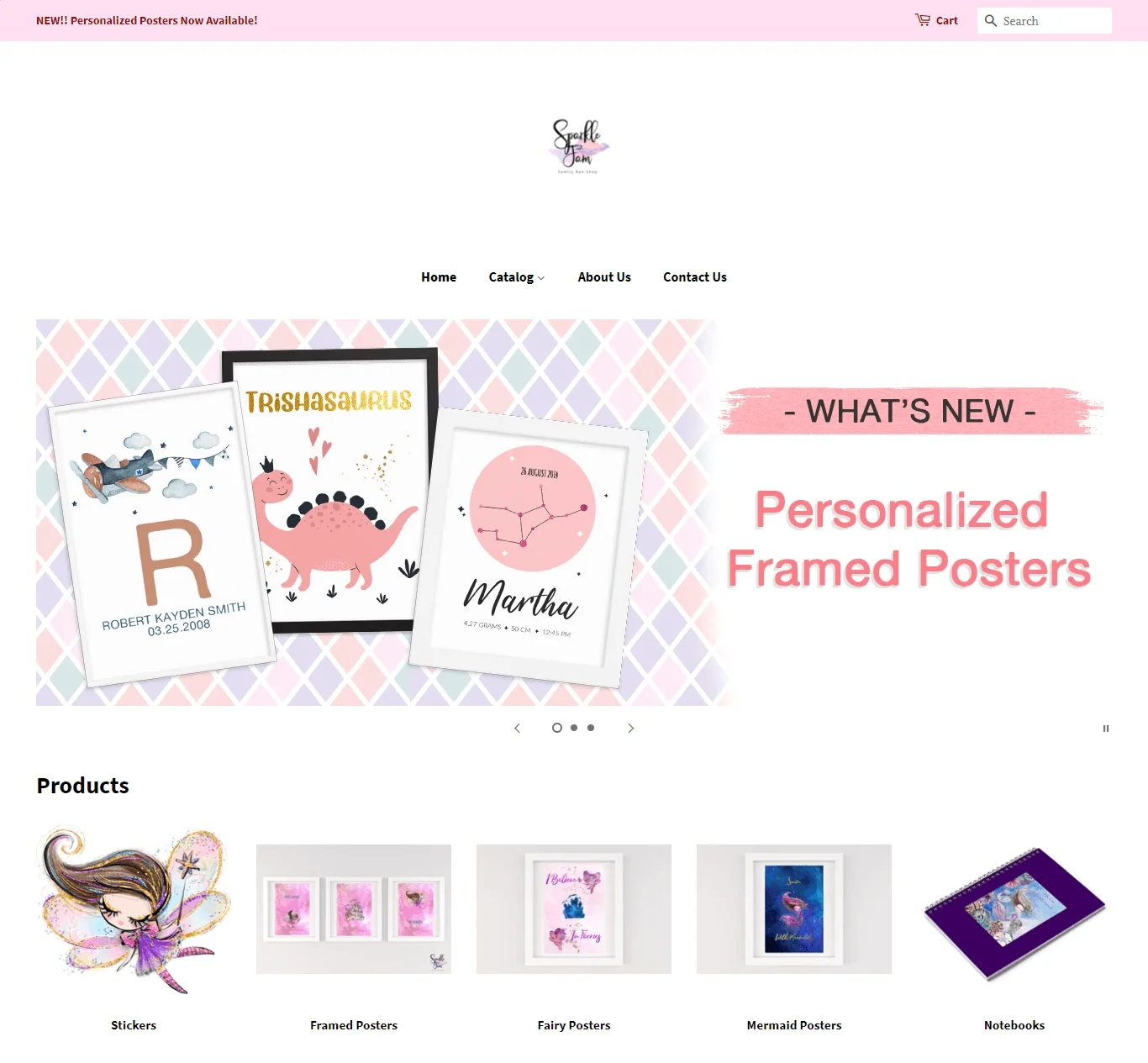
This website design we created for a client that sells children’s decor and accessories helped them generate 19.6% conversion rate!
As a business whether you have an online store, brick, and mortar, or are selling a service, your main goal is to win over potential customers.
Make sure users choose you over the competition.
Ready to wow your customers with a really cool website design? Contact us and our web design experts can help you make your dream a reality!
Other Website Design Resources
- Basic Website Design Elements Every Business Should Have
- How You Too Can Achieve Award-Winning Website Design
- Mobile Website Design: What Customers Want to See on Their Phones
- Results-Proven Methods to Creating Great Web Design
- 14 Aspects of Beautiful Web Design to Elevate Your Small Business
- 16 Great Web Design Tips to Improve your Bounce Rate
- Top 10 Reasons SEO Web Design is Important for Business Success
- 10 Web Design Best Practices for Greater Business Success
- 11 Important Characteristics of Effective Website Design
- Why Simple Website Design is the Best Website Design


