Recognizing award winning website design is one thing. Implementing their best practices is another.
You shouldn’t look at phenomenal websites as a template to copy rather than inspiration to elevate your own personal brand.
Pick apart what about it works.
Pick apart what they accomplished to captivate your attention.
Most importantly, find out how these contributing factors can be utilized.
You may even be able to improve upon their strategies.
Good website design not only keeps users engaged, but also builds credibility and leaves lasting impressions.
There are always more aesthetically pleasing ways to offer website design, content displays, and a digital marketing strategy.
The user will feel like you have value to offer if you can showcase your business correctly.
We are here to present some award winning website designs and the factors that contribute to their success.
We also want to show your how these award winning website designs will help you achieve your business goals.
What Your Website Should Accomplish
There are many things your award winning website design should accomplish.
Here are just a few descriptors you should keep in mind when planning a vision for your website:
- Accessible
- Adaptable
- User-Friendly
- Intuitive
- Consistent
- Aesthetically Pleasing
- Simple
Overall your website should be an experience for your customer.
Your award winning website design should be a reflection of the quality of product or service that your business offers.
People only give websites a few seconds of their time before they decide whether or not to continue.
Use those precious moments to wow your customer and take them on a carefully crafted journey.
Let’s explore a few business’s with award winning website designs and dissect what they have accomplished.
12 Award Winning Website Design & What They Did Right
#1: JustCoded
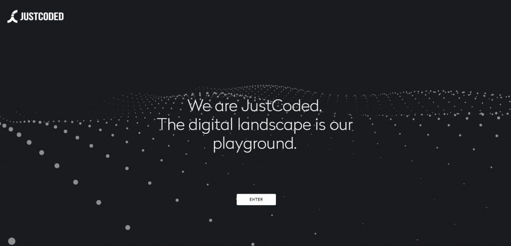
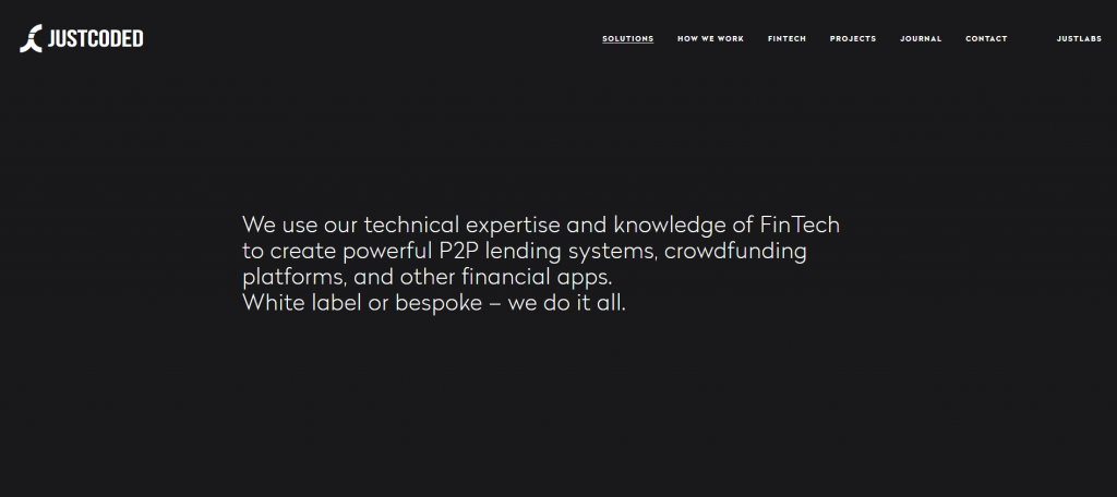
What they did right: Makes use of user input for a custom designed interactive display.
Minimalist styling and navigation. Straightforward landing page. No confusion on what they have to offer.
Can you guess what this company does? I’m sure it won’t take long.
Businesses love straightforwardness, and this company hit the nail on the head.
JustCoded is a high-tech business that creates custom platforms and frameworks for other businesses.
In the B2B space, credibility and no fluff go a long way.
By crafting a custom-made website, they display their technical prowess.
They also make use of the rest of their homepage by showcasing their past projects.
Not only that, but beside each project they list the relevant languages and tools used.
This is a great way to highlight core competencies and get straight to the point with what you have to offer.
Further down the page, JustCoded employs the use of a carousel that gives you a face to face with their management team.
Right under this, they show off the large brands that they have been showcased on and the ones that they have worked with.
Again, for a B2B brand these are textbook examples of how to build credibility and trustworthiness with future customers.
Associating yourself with established companies has a near-field effect.
Likewise, seeing who you are working with makes the business relationship personal and much more transparent.
At LYFE Marketing we are very aware of the effect that associating yourself with established brands has.
On our website, we stand by this strategy by incorporating a banner of well-known publications we have been featured on.
If your business has positive press, wear it like a badge of honor on your website.
Some takeaways for similar B2B businesses:
- Using photos of your core team
- Including past projects
- Using testimonials
- Associating yourself with other established brands
#2: Zillow
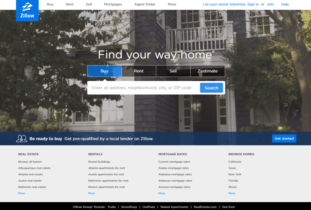
What they did right: Number one thing is the quick call to action.
They also make a great use of their background by using an ambient and relevant display.
For businesses that operate by providing a service (especially a free one like Zillow), a quick distance to the interface is preferable.
When you are providing a free service, ease of use and a headache free interface are everything.
If you are a frequent user of a tool based website like Zillow, you do not want to be bogged down every time you visit the page.
Compounding on that, their entire website exists above the fold.
Every feature and call to action is readily available the second you land on the homepage.
Zillow’s core business exists on their website, so they have a bit of functionality beyond normal businesses’ websites.
An intuitive and accessible interface is key to staying on top in your space, especially if you operate like Zillow.
We here at LYFE Marketing believe in an accessible and easy-to-use interface.
This is why we incorporate the same style of homepage where the calls to action are immediately presented to you.
Calls to Action (CTAs) are integral to conversions on your website.
Without them – people will be confused on how to capitalize on the information you are presenting to them which could lead to a lost customer.
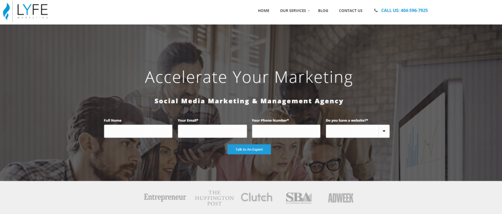
Be sure to make use of CTAs frequently on your website and make sure they are readily visible.
They are the deal-closers and are arguably the most important feature on your website. They should be a focal point of your website.
A good rule of thumb is to minimize how many clicks it takes for a customer to perform a desired CTA.
#3: Fig and Yarrow
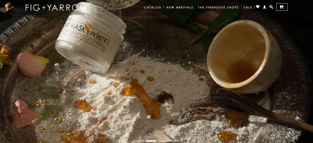
Fig+Yarrow is an all-natural bath and body products business. They are in a very creative sphere.
And they exemplify that by showing their own artistic flair through full page imagery.
What they did right: High quality and highly creative photography.
Adhering to their aesthetic, they utilize a slider of high-quality hero images that cater to the demographics they are targeting.
For most consumers, photography is the #1 factor when deciding to buy a product or not.
High-quality imagery on your landing page as well as high-quality product photography will definitely pay for itself in the long run.
From a technical standpoint, optimize the pictures for performance across all platforms.
Over-sized image files will contribute to poor loading times which in turn will contribute to higher bounce rates.
Because you are marketing towards a specific audience. Try to keep the photography relevant and consistent. Many businesses fall into this trap.
You may know what you are taking a picture of and although it may be high quality, it may not be relevant to what you are selling.
This is especially crucial if your business errs on the creative side like Fig+Yarrow.
By a quick glance at your homepage you should be able to tell what it is that your business sells.
Fig+Yarrow definitely passes this metric which is why they have an award winning website design.
#4: Grovemade
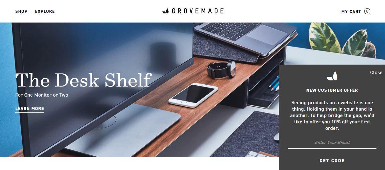
What they did right: Showcasing specific products through lifestyle hero image examples is a great way to display functionality.
Instead of using intrusive popups, they incorporated a corner pop-up that does not take away from the experience of their site while still adding value.
Again, winning product design is one of the best contributors to sales.
Grovemade, a home accessory company that specializes in unique warped wood products, knows how to display their products.
Using lifestyle photos and a trendy isometric manner, they showcase featured products as their landing page.
Each of their product category pages follow in the same manner.
On top of that, Grovemade uses clean and consistent product photography that gives you more viewable angles when you hover over the product.
Notice the use of pop-ups on their homepage as well. Non-intrusive right?
This is a great way to get the same value out of a pop-up without off-putting your customer. Banners are a great way to have the same effect as well.
High-quality photography and in depth photography will be crucial to your award-winning website design.
Especially when it comes to e-commerce, the e-commerce product photography is king.
People want to know what they are buying, and a lot of people want every inch covered.
Think about using intuitive and interactive design cues like hover-able elements to accomplish this.
#5: Toggl
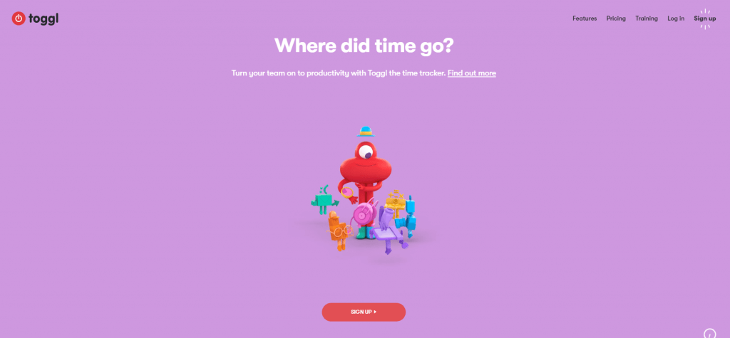
What they did right: Custom illustration and custom imagery. Great use of popping color schemes.
Toggl is a quality service that tracks time and productivity and is sold as a license to businesses.
What makes their website exceptional is the use of beautifully designed animations.
Not only do they use ‘cartoon’ animations, they use custom animations while scrolling and loading new pages.
Toggl’s colorful cartoons and quirky animations are sure to leave lasting impressions.
They use these to their advantage while describing the benefits of their software service.
An otherwise boring presentation can be elevated by taking design cues from this website.
Custom illustrations are valuable and custom animations take it to the next level. They keep the user engaged and are a fun way to express your service.
While they can be technically challenging to make yourself and can be costly to have made for you.
They are an investment you should think about making.
Also, when implementing animations, optimize them as to not bog down your website’s loading speed.
Visit the website yourself and see what you think.
At the very least it makes the website feel like there was an attention to detail. One of a kind, no doubt.
#6: Grailed
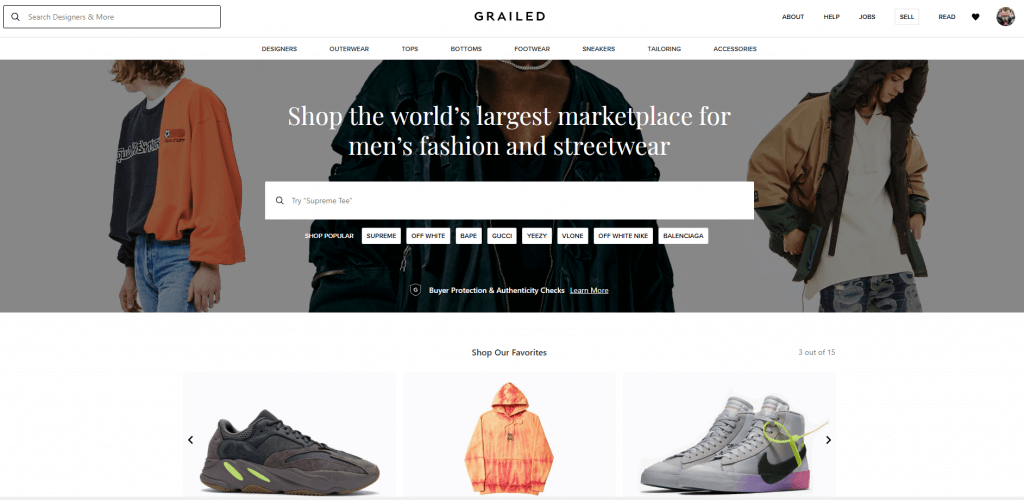
What they did right: Effective navigation and CTA’s. Continuously updated interface so the carousal and hot searches are always relevant.
Using new imagery (business centric) keeps the front page enticing and fresh.
Grailed is a marketplace for new and used clothes and shoes that attracts a large user-base to their website.
You can browse through hundreds of brands and sell your own merchandise.
Excellent navigation and enticing imagery are this company’s wheelhouse.
Their business relies on bringing in both buyers and sellers to their website to conduct business while they cut a fee.
Take a few design tips from this brand by making sure your content stays current and is on top of trends within your industry.
Again, if your business is a service on your website, make sure your tools are easy to use if you want an award winning website design.
#7: Gymshark
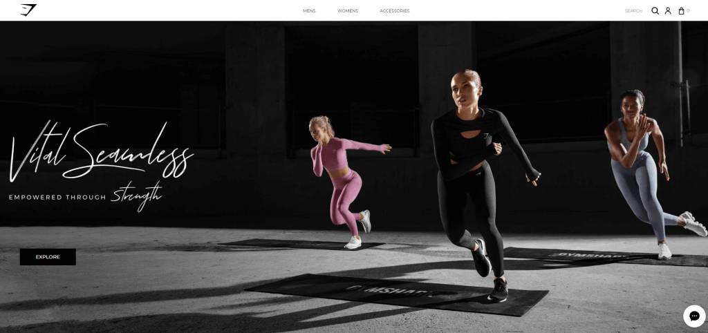
What they did right: Stylistically they went for a bold hero image approach.
Using high quality photography that fills the entire homepage and bold typography that leaves an impactful impression.
Images now, more than ever, can help build your brand.
Some designers opt to put them in circles, render them in black and white, add a drop shadow behind, etc,.
All these techniques aim to highlight the images more. This is to showcase the photos among the other elements on the page.
Gymshark is a gym-wear and active clothing brand that has garnered its own cult following.
When you buy from them you know what you are getting, so they make use of their homepage to showcase the clothing they have to offer.
Rather than employ simple product photos, they use a ‘lifestyle’ hero image in a creative manner.
Their design choices might be quite reminiscent of other famous active-wear brands you know too.
Both Nike and Adidas often use the same approach to use large, full page hero images that usually err on the creative vs functional side.
This is probably deliberate.
Rather than thinking of it as a carbon copy, think of it is a tip of the hat to effective design ques.
Use what works and adapt it to your own brand.
They also opt for the minimal navigation and banner bar.
Men, Women, Accessories, followed by free shipping over $75 with free US returns is all they need to persuade customers to explore their website.
All in all, their bold and simple approach makes their site an award-winning website design.
#8: Careof
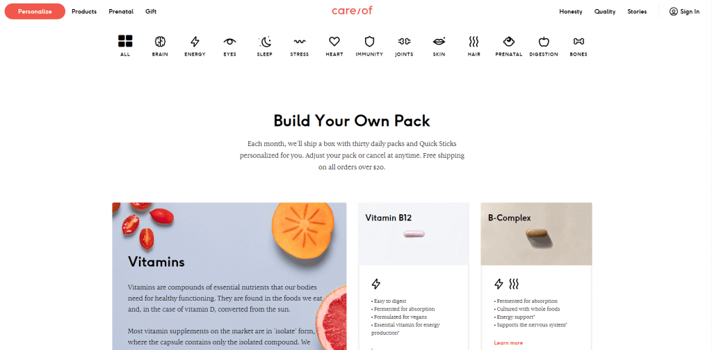
What they did right: Custom icon navigation bar.
Quick rundown of different product lineups in relevant groupings help boil down an otherwise complicated product.
Subscription vitamin service, Careof, is a great example of effective marketing through a truly award winning website design.
Supplements and vitamins are a highly saturated market, and the average customer isn’t fully educated on the spectrum available.
Not only that, but the science behind them can be very dense and complicated. Careof solves these issues through a refined layout.
Up at the top they utilize custom icons in a quick navigation bar that makes choosing the right product easy for any customer.
People love pictures, and people love infographics.
Rather than crowd the page with words, or bury navigation in drop down menus, think about something like Careof’s design.
Once you land on their product pages, they boil down the process even further.
Instead of hard to read walls of text, they use a quick bullet and segmented style to present their product lineup.
Again, they employ their icons to make understanding a product a quick process.
They are aware of the snake oil salesmen in their industry as well.
Oversimplification of what can be considered ‘medicine’ is a slippery slope, and they understand that.
On each individual product page, Careof goes into high detail about the research behind each supplement and even…
…provides the source material for you to judge yourself.
Transparency is a merit to boast when conducting business.
Especially for industries that may be notorious for deceit, being up front makes all the difference.
#9: Material Design/w3schools
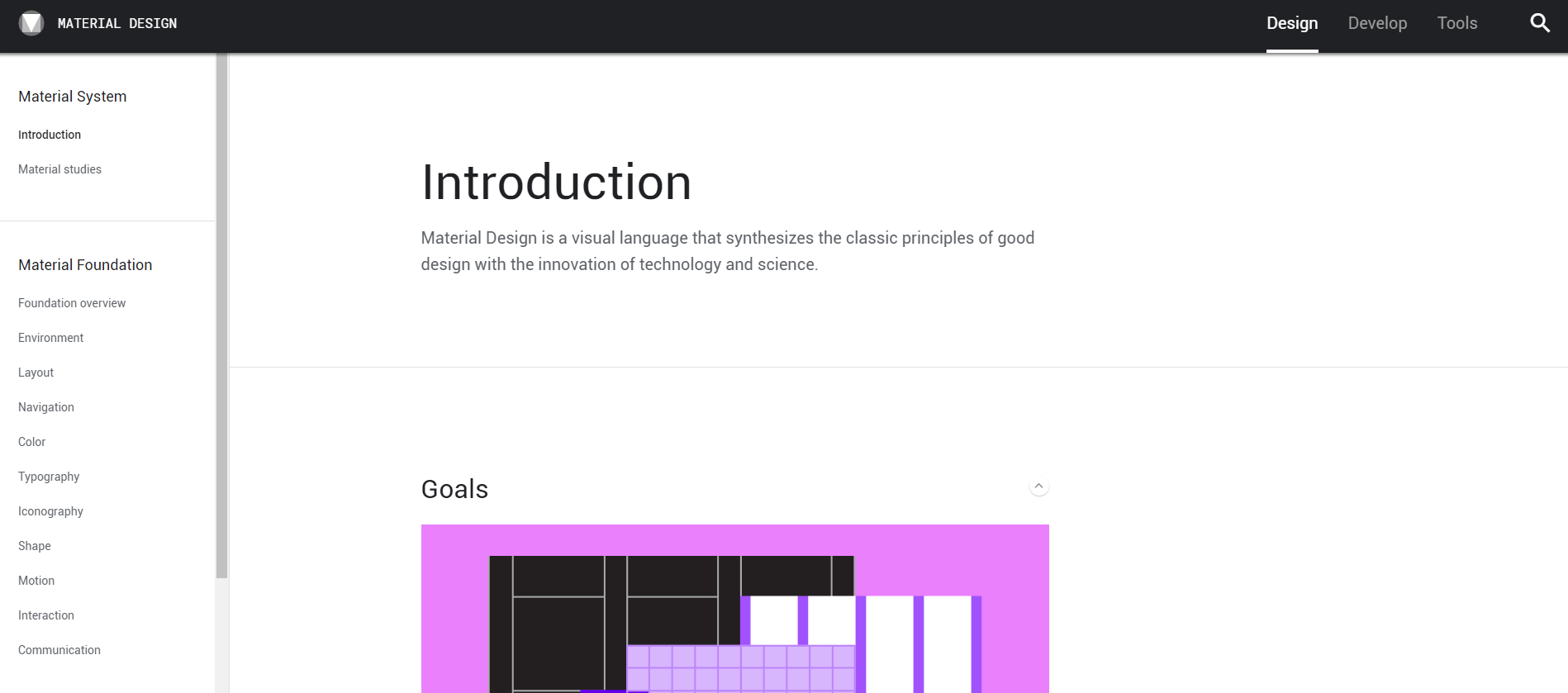
What they did right: Table of Contents style navigation. Optimized for ease of use and quick reference.
Material Design is a website proprietary to Google that teaches developers to follow a best practices standard when designing applications.
Coined material design, it is a set of guidelines that make UI intuitive and provide the best experience possible to users.
What’s most notable is their navigational design choices. The table of contents style menu in the sidebar is great for these reference style websites.
The bigger categorical menu is at the top right, while the bulk of the content is on the left sidebar.
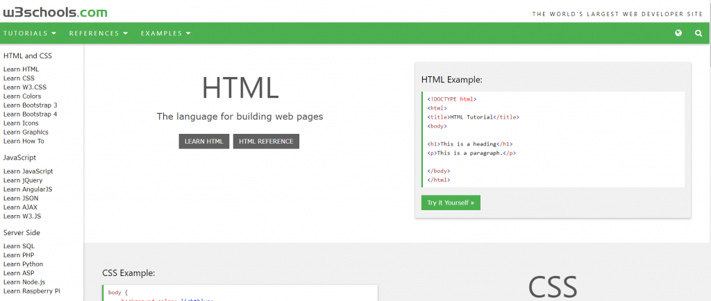
Other websites of similar content make use of the same quick reference style.
w3schools.com is a free site that is used as a quick reference for people learning software development.
Notice the similarities in their design choices.
Navigation and intuitiveness are important features if you want your site to rise to the top among competitors, especially in a free model.
These are both high authority sites respective of their content and for good reason.
Although these are not businesses, they definitely exemplify an award winning website design.
#10: Lyft
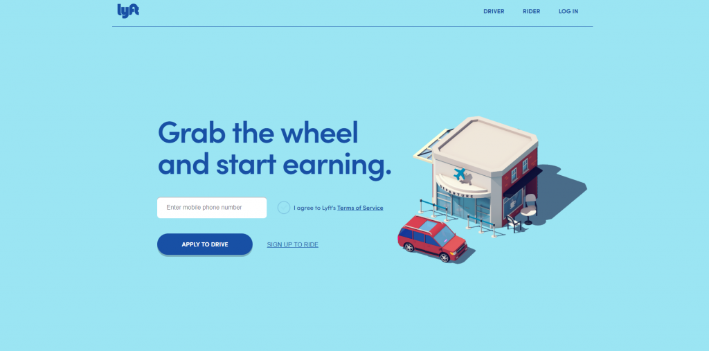
What they did right: Minimalist design, both elements on the screen and text. Excellent use of whitespace.
More than likely, you already know about the ride sharing service Lyft, and Lyft knows this.
Even more likely, you are already know everything about the company before you land on their website.
Lyft knows that they do not need to crowd the screen with too many design elements or text explaining their service.
A quick caption ‘Grab the wheel and start earning’ and a CTA is all they need for a landing page. Straightforward and to the point.
Their use of whitespace also gives a great amount of visual breathing room. Don’t be afraid to leave a lot of your website blank.
It draws the eye to what’s important and frames what you have added while also adding value.
Don’t be afraid to cut down on copy either. You may get the feeling to bombard your customers with information, but this will actually work against you.
Being concise goes a whole lot further for your marketing than walls of jargon dense text.
So for a takeaway, maybe opt for a minimalist design.
It avoids information overload and you can put more time into crafting what you do decide to add to the page.
#11: Helix
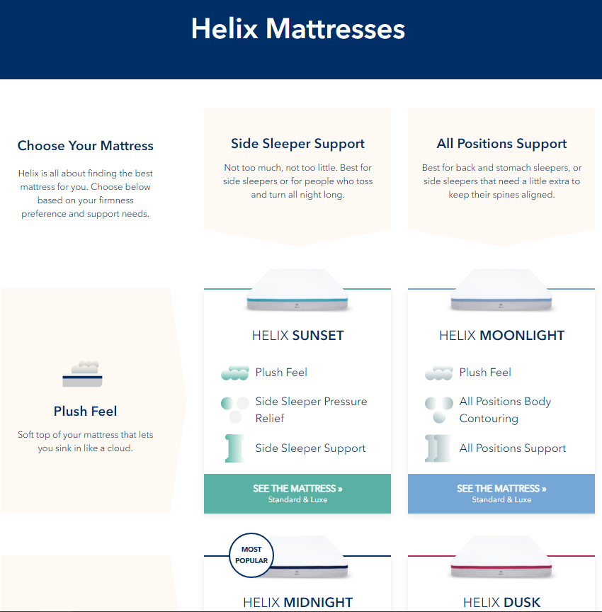
What they did right: Intuitive product page design. Custom icons and unique grid layout make it easy to decipher their offering.
Helix is one of the up and coming internet mattress brands that are revolutionizing an established industry.
They make shopping for a mattress very easy and affordable.
When making such a large purchase people want to know what they are getting.
Breaking down your product lineup into a grid-like spreadsheet is an intuitive way to display your offerings.
They also make use of custom icons and a color-coded product lineup to make it that much easier on the customer.
Product pages are not a one size fits all approach. Try to tailor your website to your business and your industry.
Anything that makes the shopping experience goes much more swimmingly for the customer will leave a lasting impression.
#12: Apple
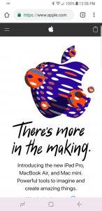
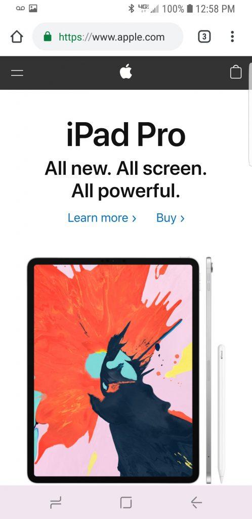
What they did right: Seamless design between…
…mobile and desktop websites.
Scrolling in the main navigational element.
Icons adapt based on mobile design cues.
Unsurprisingly, Apple, the king of product design.
Has their mobile and desktop sites seamlessly designed.
More than half of online traffic is through a mobile device and that figure will only rise in the future.
It is crucial make sure that your website is accessible to the majority of users and also…
…make it designed as well as you did with your desktop site.
When it comes to optimizing for mobile, there are a few tips to keep in mind.
- Make sure that scrolling and streamlined menus are the main forms of navigation.
- Also make sure that text is made much larger for mobile devices.
- Make sure buttons are also sized reasonably so that people do not mis-click or tap incorrectly.
- Opt for sans serif text. It improves readability, especially for people accessing your site through smaller screens.
Apple also keeps minimalism at its heart and you can tell they are fond of whitespace.
Especially on mobile devices, the less is more philosophy will go a long way with customers.
To sum up…
While this list doesn’t even breach the tip of the iceberg when it comes to award winning website design.
It is a good place to start and get the creative juices flowing. Your website is your business, so being unique and clean must be a priority.
Here are some of the takeaway’s discussed in this write-up that you can use going forward with your own award winning website design:
-
If your business is a service offered through your website, make the homepage an easy to use tool with immediate CTA’s.
-
Don’t forget to make CTA’s accessible and obvious elements of your landing page.
-
Use ample whitespace. It gives your page a quality feel.
-
Don’t be afraid to write less either. Effective and marketable text is usually catchy and precise.
-
Quality, both in resolution and composition, photography is a leading factor for people making purchases. Make it a focal point of your site.
-
Custom elements like animations and icons add a ton of value to your website.
Although a more technical aspect, it really makes your website stand out.
-
Product Pages are not a one size fits all.
Depending on how many products you offer there are a thousand ways to present information in a creative manner.
-
People like testimonials. Compounding on this, people like businesses that are associated with businesses familiar to them.
It adds to credibility and trustworthiness.
-
Think about adding photos of your core team. People also like associating a face with the business they are going to give money.
-
If you are a bespoke service/product, add past products to your main page to immediately showcase your value.
-
Navigation is how people will explore your website. Try to streamline it as much as possible and make it intuitive.
Don’t bury everything in drop down menus.
-
On mobile devices, make text and interactive elements like buttons reasonably sized.
-
Scrolling is your best friend when it comes to navigation. It is most peoples first instinct when visiting a site.
-
Opt for sans serif text to increase readability across all devices.
Award Winning Website Design is Effective
As you can tell, there are a million ways you can have an award winning website design.
No one design will fit every need, but they each are impactful and effective in their own unique ways.
Find what works for you.
Craft a user journey and an experience for your customers.
Just go for it.
Remember though, don’t fall prey to the temptation of redesigning your website continuously.
Award winning website design is effective, and you shouldn’t fix what isn’t broken.
Be confident in your choice of design. More importantly, be thoughtful and meticulous when building your own award winning website.
This will ensure that the user feels like everything has its purpose and they are exploring the website through your crafted journey.
If you need help elevating your website to the next level or are unsure of where to begin, contact us.
We specialize in helping businesses make their website and digital presence their most valuable assets.
You should be confident in your website design so that can focus on more important aspects of your business.
Your marketing budget shouldn’t be used to establish yourself. It should be used for investing in growth services.
If you are confident in your award winning website design and have come to a roadblock on how to achieve more growth online, LYFE Marketing is still here to help.
Other Website Design Resources
- Basic Website Design Elements Every Business Should Have
- Mobile Website Design: What Customers Want to See on Their Phones
- 9 Elements of Cool Website Design For Your Business Page
- Results-Proven Methods to Creating Great Web Design
- 14 Aspects of Beautiful Web Design to Elevate Your Small Business
- 16 Great Web Design Tips to Improve your Bounce Rate
- Top 10 Reasons SEO Web Design is Important for Business Success
- 10 Web Design Best Practices for Greater Business Success
- 11 Important Characteristics of Effective Website Design
- Why Simple Website Design is the Best Website Design


