


For most, your website will be the first impression they have of your brand and trust me when I say great web design goes a long way when…
…making that first impression.
It is what customers experience before they even have the chance to be sold on your product or service.
It is the face of your company and the portal most people will go through to conduct business or digest your content.
So why wouldn’t you want to keep your face clean and professional?
Customers will only provide websites with a small amount of their time.
So every second count when trying to compel them to stay longer and lead them to a conversion.
Not everybody knows how to create a great web design, but I guarantee almost everybody knows what it looks and feels like.
Great web design is a tried and true way to increase your earning potential and ROI.
You can have a very successful social media campaign and create compelling content.
But a poorly designed website will only serve as a bottleneck for customers and your earnings.
Building trust and instilling value into the customer stems from having a great web design.
It all comes down to incorporating a thought-through methodology when piecing your website together.
Here we will discuss results-proven methods to include in your great web design toolbox.
What is Great Web Design?
Great web design is effective. Simple as that.
It serves a purpose to build credibility by being intuitive, establishing trust with an aesthetically pleasing design, and converts visitors with…
…effective calls to action.
Your website is your store and your salesperson when you can’t be. Keep it inviting, easily navigable, and conducive to conducting business.
Standards of great web design are always changing with our tastes and the development of more modern layouts.
Stay on top of the trend, but always keep in mind the design standards we will discuss in this article.
Results-Proven Methods to Creating Great Web Design
1. Create a User Journey & Conversion Funnel
Perhaps the most overlooked aspect people forget when designing a website is the user journey.
How do you expect people to navigate through your website, find the information they need, and end up as a conversion?
Answer these questions to see if you are on the right track.
- Does your website have intuitive menus that aren’t overdesigned?
- Do you have calls to action readily present and labeled?
- Does your website have a high bounce rate?
- Do you have a conversion funnel?
Keeping in mind your buyer personas, when laying out your great web design, think of how visitors will travel through your website.
A conversion funnel is simply the pre-designed path a visitor should take through your website to lead to a conversion.
This is the path they will take from the homepage to the shop, to the product page, and ideally to the cart and checkout.
These paths need to be defined.
Is there a clear contact link somewhere on your landing page? Can a user find reviews on your product or service somewhere on your website?
Most customers will browse your website before going straight to purchase so make sure they can easily find their way around.
Make sure they aren’t spending that time playing a guessing game looking for information.
Started with 1 First Page Ranking for non-brand Keywords and went to 21 with the help of LYFE Marketing!
2. Where is your Call to Action?
The most important feature of a proper conversion funnel is simply the calls to action.
Without calls to action, you are missing the point of designing the website effectively.
These look like ‘Subscribe’, ‘Contact Us Today’, or ‘Shop Now’ buttons.
Your website should very clearly convey what exactly your business does.
Next, it should intuitively lead them to perform the desired call to action and become a conversion.
After that, you have a customer in your sales funnel.
Make sure CTA’s are a focal point of your page and that the buttons look aesthetically clickable.
A good rule of thumb to keep in mind when creating a great web design is how many clicks it takes for a customer to perform your desired CTA.
You know your buyer personas, and you know what they came to your site looking for.
Your great web design should focus on directing the customer to a single call to action.
It’s a lot easier to make a decision when you are not overwhelmed with clickable options.
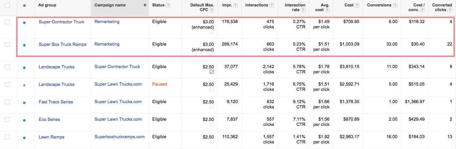
We managed to get 74 Conversions and $178.83 average Cost-per-lead for their top 2 campaigns (trucks sell for $5,000-$30,000).
3. Keep it Simple
Sometimes over-design can be the death of a website.
This can be done with too many widgets, too much text, or by being too vague about what it is your company does.
Not only that, but over-design can slow down your page loading speeds and lead to a higher bounce rate.
Instead, keep your writing and design straightforward, simple, and to the point, without sacrificing quality.
Avoid using industry jargon that is too high-brow for the average customer.
Think like you are writing for a magazine headline, or for a poster. Simple and concise while also being effective.
Minimalism is a design principle you should be taking to heart. Less is more.
If the customer cannot navigate through your website or cannot tell what your business does, then the problem rests on your web design.
Impressions are everything.
Look at Uber’s website in the image above. It is stripped down and to the point.
You are presented with a concise blurb on what they do and are immediately presented with only 2 options to ‘sign up to drive’ or ‘sign up to ride’.
The Call to Action buttons are very clearly labeled, and you have a quick understanding of what service they offer.
Now, take a look at Apple’s website pictured above. If there is anything that can be said about their web design, it is their great use of whitespace.
And no, whitespace doesn’t have to be white. It can be an empty region that frames your text or pictures.
Don’t be afraid to use it. It gives your content breathing room and draws the eye towards what’s meaningful instead of feeling overcrowded.
Otherwise, you will have information overload and your customer will not be able to navigate quickly.
When you walk into a store and there are a few items on their tables, it gives a feeling of quality vs. a store with tightly packed shelves.
This is the same design philosophy behind the use of whitespace.
Don’t be afraid to cut down on writing either. People don’t want to be bombarded with walls of text when they land on your homepage.
Opt for media that fits your aesthetic, or concise headlines and infographics.
Nobody has ever turned away from a homepage because it was too beautiful and relevant.
Take a look at this high-end audio equipment company, JDS Labs.
See a common theme?
They lead with enticing photography and a focally centered call to action button that leads to their shop.
There is minimal text, but you can quickly find their menu, cart, shop, and banner info. It is no question what line of business they are in either.
Opt for SEO-optimized video, or a large hero image, or anything you think will compel the customer to continue.
4. Keep it Consistent
Again, exercise minimalism. Nothing is more distracting and downright confusing than the use of too many color schemes, fonts, and branding.
If a website looks poorly designed, then trustworthiness to do business also suffers.
Try to adhere to a group of colors that fits your aesthetic and stick to them. Also use only a couple of fonts across logos, headings, and body text.
Use font sizes appropriately and don’t overuse bold, italics, underlining, or any combination of the sort.
- When choosing colors you should keep contrast in mind. Pair simple colors with text and with a high contrast background to improve readability.
When choosing fonts, keep this tip in mind:
- Because a large portion of your audience will be reading on a smaller screen, try to opt for sans serif text in your body text.
On smaller resolutions, it improves readability and will cause less eye strain for your readers.
Let’s use PayPal’s website as a case study.
- How many fonts can you count on their website?
- How many distinct colors does their UI use?
- Where are the clickable links on their homepage?
These questions should be pretty easy to answer because PayPal, a large international company, has the resource to follow standard design cues to a T.
They limit their colors to neutral plus one contrast color, blue.
They have minimal differences in font, size, and typography – and when they do, it is for good reason.
You can also tell what’s a clickable link, what’s a menu, and what is supplementary text.
There are certain standards you should adhere to when placing certain items, and we’ll cover that in the next section.
5. Design Cues
From website to website, you will start getting an idea of what is universally accepted conventions for designing your website.
Adhere to them and you will have the foundation for great web design.
These are by no means laws of web design but having an intuitive design people are accustomed to will make everything go more smoothly.
- Sign Up and Login buttons are usually located in the top right of the web page.
- The Cart is almost industry standard to appear somewhere in the top right of the page.
- Your logo should be clickable. It has become expected that clicking the logo will return you to the homepage.
- A Call to Action button should be high on the homepage, and ideally visible the second they land on the page.
Make sure to make it obvious that it is clickable. - Buttons should look like buttons. Make sure that they are boxed in and look clickable. Using colors with contrasting text isn’t a bad idea either.
- Logos are placed at the top of the page, typically in the top left or center of the header.
- Search bars are usually placed somewhere in the header, but ideally, your customer should never have to use it if your navigation is optimized.
- Main navigation menus are usually found at the top of the header, but the left margin has been used before as well.
- Leave secondary navigation such as breadcrumbs. (Home > Category > Sub-Category > Product)
- If making a customer fill out a form, especially contact forms, limit the number of fields necessary.
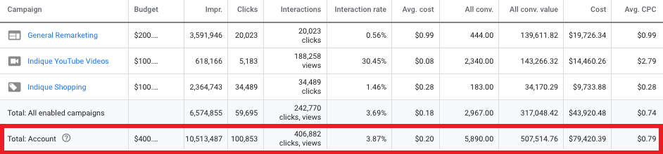
We generate 5,890 Conversions.
6. Quality Photography
Research has shown that quality photography is one of the leading factors that have led customers to purchase online.
It is one of the leading drivers for customer engagement on websites, and it is easy to implement.
On our LYFE Marketing website, we use candid photos of our staff.
We believe it makes a more personable impression to get to who you would be working with if you use our services.
You also won’t find the same photo anywhere else on the internet!
Be sure your photos are high-res and crisp but also load in a decent time.
Don’t opt for large picture files either with unnecessarily high resolutions because they can contribute to high page loading speeds.
You could argue that navigation is the most crucial feature of great web design, but again it is simply one among many.
According to Nielsen in a research study on how people read websites, 79% of people scan their web pages while only 16% read it word by word.
Because scanning has become the dominant way people read online, you’re going to have to design your website accordingly.
A good measure of scan-ability is to see how long it takes someone who doesn’t know about your business to figure out what it is you sell or do.
Another test is to see how long it takes them to perform a CTA.
These are important website metrics to take into consideration when designing the pipeline for your website.
Thankfully, most people read in a very predictable pattern, so designing your content hierarchy around it wouldn’t be a terrible idea.
People tend to guide their eyes towards headlines, images, infographics, and bulleted items for navigation.
From there, people tend to read in an F-shaped pattern, starting at the top right and moving across to the right before down (as in the graphic above).
To keep people on the page and keep them reading, make your content engaging.
Include captivating pictures, intuitive infographics, astounding statistics, or one-sentence pitches to snag your readers’ attention.
Also, keep in mind that scrolling is going to be your friend when designing a website.
Mobile users have surpassed desktop users which makes scrolling the dominant form of interaction with a site.
Social media has adopted the layout for good reason.
With modern internet speeds, scrolling is the quickest way to access information and much more favored than clicking open new pages.
It segments information into bite-sized amounts which can play in your favor when designing your website.
No great web design has users scrolling left to right, so yours shouldn’t either.
Scrolling up and down, clicking internal links, and as a last resort, using the search function should be the only form of navigation.
Think about designing your site in horizontal strips, with each new ‘page’ in descending order of importance.
Your reader will most likely look at the most eye-catching aspect, read left to right, and then scroll down.
Your great web design should be prioritizing the most crucial information and calls to action above the fold.
No longer does above the fold just refer to newspapers.
Keep it eye-catching and enticing above the fold if you want the customer to ‘buy’ and open up the rest of your newspaper.
Base your reading hierarchy off of predictable patterns.
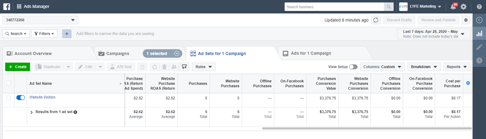
We generate $3,000 in conversion value and generate a ROAS of 82.62 in just the first week of implementation.
8. Responsiveness
Did you know, according to KISSmetrics, on average if a landing page takes over 3 seconds to load, then a whopping 40% of users will abandon the site?
Did you also know that, according to Google, the average time for a mobile page to fully load is an absurd 22 seconds?
Just because other sites aren’t paying attention to their lost potential, doesn’t mean you shouldn’t.
Having a responsive website is an absolute must and is the first step to great web design.
Otherwise, you will suffer from a low conversion rate non-indicative of your visitor count.
Your bounce rate and time on site will also negatively correlate with your page loading times.
It is crucial to test your landing page loading times before you go live and open for business. It’s an easy fix for such a large potential loss.
Be mindful that excessive widgets, exceedingly high-resolution images, and a lot of moving parts will contribute to slow loading speeds.
9. Accessibility
You want to ensure that the users viewing your site on mobile receive good first impressions.
A responsive and easily navigable site that adapts to the device is the best way to accomplish this.
Almost half of all traffic is on a mobile device.
The technology in our phones is catching up to computers, and trends show that more and more people are browsing on their phones.
Mobile website design should be standard and even Google is recognizing this by redesigning SEO to favor mobile-optimized websites first.
Keep in mind these web design tips when choosing a theme or designing your own website.
- Phones, Tablets, and Desktops all have different resolutions and aspect ratios, so design your website with adaptiveness in mind.
- Scrolling is an integral part of website navigation, so make sure it is a primary method on mobile and opt for a single column layout.
- Touch screen navigation can be difficult if buttons are made too small for the user.
- Don’t use Flash because it is not used on all phones and is bad for SEO indexing. HTML5 can be used for effects instead.
- Be concise and effective with search titles, URLs, and meta descriptions. You won’t have as much room on devices with lower screen sizes.
- Avoid too many pop-ups if at all. They are harder to deal with on mobile and could lead to a higher bounce rate.
- Limit the need for typing on your website.
Google’s SERP is moving to mobile-first and so should your design philosophy.
It tends to lean towards a cleaner and more straightforward design when keeping mobile viewing in mind.
Also, don’t limit ‘mobile-first’ to be a stripped-down version of your original design.
Remember that mobile users have the ability to make calls, use their GPS, and take pictures and video as well.
So many more features can be integrated into a mobile site beyond great web design.
Depending on your business, mobile use may be the primary way people interact with your business.
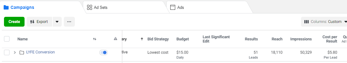
We managed to get 51 Leads at $5.80 per lead using Conversion Ads
10. Search Engine Optimization (SEO)
A hallmark of great web design is how well it ranks in search engines.
It gives a backdoor glimpse at the structure of the website and is indicative of how much organic traffic you will receive.
Great web design with great SEO comes down to exercising good habits when formatting your website.
This can come down to making sure your website isn’t slow.
Having a sitemap crawl-able by a search engine, HTML title tags, keyword optimization, and much more.
SEO in itself can never be fully covered in one article. If you know that SEO is what your website needs, then feel free to contact us at LYFE Marketing.
We also offer a suite of SEO services to ensure high traffic, better search engine ranks, and we provide measurable results.
11. Templates vs Custom
Using a template vs a custom website is an age-old argument.
Both have their pro-cons, but ultimately it is up to the business owner to decide what their priorities are and what is most important.
Take a look at each and make the decision yourself.
A template website usually lends itself to a faster development time, because everything is already laid out for you.
It is a lower cost, lower barrier to knowledge method to get a good-looking website up and running.
The downside is that it may have redundant features that you do not need.
It may not be supported across all platforms and may not be continuously updated.
What you see is what you get, and others may have the same template as you.
If you opt for the non-custom option, some keen customers can tell a certain template brand was used.
With a custom website, every feature will be tailored to your specific needs and your website will be one of a kind.
There will be a higher cost upfront, but with a knowledgeable web developer, you will have constant development and updates.
The site will also be guaranteed compatible across all platforms and will grow with your business needs.
The development time will be longer, but again it is up to you to decide if a tailored design is a priority.
In the long run, custom sites are usually worth the opportunity cost.
If you think the leap towards a fully customized website with your own design inputs is what you want, then contact LYFE Marketing.
We have the talent to make your design come to life, and the expertise to optimize it for search engines and device compatibility.
Your Website Can Take You to the Next Level
A website, let alone one with great web design, is a must for a business. Your Amazon, Etsy, and eBay pages do not serve the same purpose as a website.
It is your business platform, so you better have a well-designed storefront.
Crafting a great web design can be challenging.
Follow these best practices, and your website will on its first steps to greatness. Your bounce rate and conversion rates will surely follow.
Remember, it’s all about keeping it simple yet effective. Don’t forget the calls to action, and don’t put any distractions between them and your customers.
Also, do not fall into the trap of continuously updating the core design of your website because it will feel like subtle rebranding to your loyal customers.
Be confident in your great web design and know when it is a finished product.
When you are confident that your great web design is no longer your weakest link, then you can feel more comfortable investing in other growth services.
Your marketing budget will no longer feel bottle-necked by poor design.
If you want your website to grow your business, you are going to have to invest in it.
Contact us if you need help implementing your design or would like to know how to grow your business online.
If you don’t know where to start, we offer free consultations as well.
Other Website Design Resources
- Basic Website Design Elements Every Business Should Have
- How You Too Can Achieve Award-Winning Website Design
- Mobile Website Design: What Customers Want to See on Their Phones
- 9 Elements of Cool Website Design For Your Business Page
- 14 Aspects of Beautiful Web Design to Elevate Your Small Business
- 16 Great Web Design Tips to Improve your Bounce Rate
- Top 10 Reasons SEO Web Design is Important for Business Success
- 10 Web Design Best Practices for Greater Business Success
- 11 Important Characteristics of Effective Website Design
- Why Simple Website Design is the Best Website Design
