


Good eCommerce web design is crucial for turning website visitors into customers.
Ideally, the design elements of your website should make the shopping experience and purchase process as quick, easy, and stress-free as possible.
No matter how good your online advertisements are, you could be losing valuable customers if your online store is not optimized for sales.
You could also be wasting your valuable ad dollars if visitors click off your site the second they get to it.
Follow these 23 eCommerce web design tips and you should start seeing more conversions in no time!

23 eCommerce Web Design Tips
1. Keep the user in mind
Every single detail of your ecommerce website design from product pages, to their respective product images, to contact forms…
…to the checkout page could potentially contribute to a user’s decision to make a purchase.
Your storefront should give the best first impression as much as possible.
That’s why you should keep the user in mind with every single decision you make when it comes to your ecommerce website design.
User experience is paramount to turning visitors into customers and turning customers into repeat customers.
Not sure if your website has a good user experience?
Get a second opinion by enlisting a friend or even hiring somebody to look over your website is user-friendly.
Have them rate your site on usability, navigational ease, visual appeal, and overall satisfaction.
2. Utilize simple website design
Minimalist websites are consistently rated as more visually appealing and more trustworthy than visually complex websites.
If you want to optimize your ecommerce web design for conversions, you should consider simplifying it.
To simplify the design of your ecommerce website.
Take away any unnecessary information and utilize a minimalistic design theme with plenty of white space.

The example above shows a webpage with an incredibly simple design which helps visitors get to main conversion points more quickly.
There are no distracting links, images, or videos.
The call to action is clearly defined and the simplistic design gives off a professional, minimalistic feel.
If you need help choosing a website design platform to start, consider using an ecommerce marketing service or ecommerce platforms such as:
WordPress, Shopify, WooCommerce or BigCommerce for growing ecommerce businesses.
You’ve probably noticed that most ecommerce websites have a little shopping cart icon somewhere on every page…
…(usually the top right corner) that allows users to easily view items they have added to their cart.
This is one of the most important ecommerce web design elements there is!
Having this button visible at all times while customers are online shopping has been proven to increase conversion rates.
Just make sure the icon updates real-time and is something recognizable like a shopping cart or a shopping bag.
The last thing you want to do is confuse people.
Since this is one of the most important buttons on your entire website.
We recommend making it stand out by using a bright color that sticks out from the background.
It should also be larger than other buttons to make it the easiest one to find so you can create a better ecommerce experience for your customers.

4. Be honest about pricing
Honesty is always the best policy.
When designing your ecommerce website, remember to always be upfront and honest about the price of the products or services you are selling.
Don’t try to hide the information or make it difficult for visitors to find on your site.
You never want your website visitors to feel that they are being deceived or tricked.
Burying pricing information on hard to find pages of your website can actually be detrimental.
Instead put it somewhere easy to find and simple to understand.
This rule also applies to shipping.
Always be upfront about shipping costs on your products as well as shipping policies customers may need to know about.
Studies show that displaying shipping information too late in the purchase process leads to increased cart abandonment rates.
Make sure your customers can see the total cost of a product, including shipping, prior to making a purchase.

5. Don’t distract users
Your ecommerce web design should be optimized for generating sales.
It’s nice to include additional information on your brand’s story, a blog, or even an option for website visitors to sign up for an email newsletter.
Just make sure those extra pieces of information don’t distract people from making a purchase.
For example, a form on your contact page, or at the bottom of your homepage, that people can fill out to join your email list is fine.
Just don’t make a pop-up window requesting that users sign up for your newsletter, as it may have the opposite impact of what you want.
Not only might it distract someone from making a purchase.
But it could annoy them and make them less likely to want to give you their email address and more likely to abandon their cart.
6. Quality photos
Possibly the biggest pain point for online shoppers is that they cannot see products in person before they buy them like…
…they can with a brick and mortar store.
To ease this pain point, you’ll need to enhance your ecommerce web design with high-quality product images.
And, maybe even video depending on the product.
Having high-resolution photos is an absolute must. Any blurriness or pixelation can turn would-be customers away, thinking your product is cheap.
Consider creating photo galleries for each product so that users can click through them and see multiple angles of each product.
A popular feature is a pop-up box where people can zoom in on a particular image and see fine details.
This is about as close as you can get to allowing visitors to physically pick up a product and examine it before making a purchase.
If possible, use lifestyle images of people actually using or interacting with your products.
Clothing is a lot more enticing when it’s being worn by a model rather than being laid flat or on a mannequin.
Likewise, some products are easier to sell when you can show them in action.
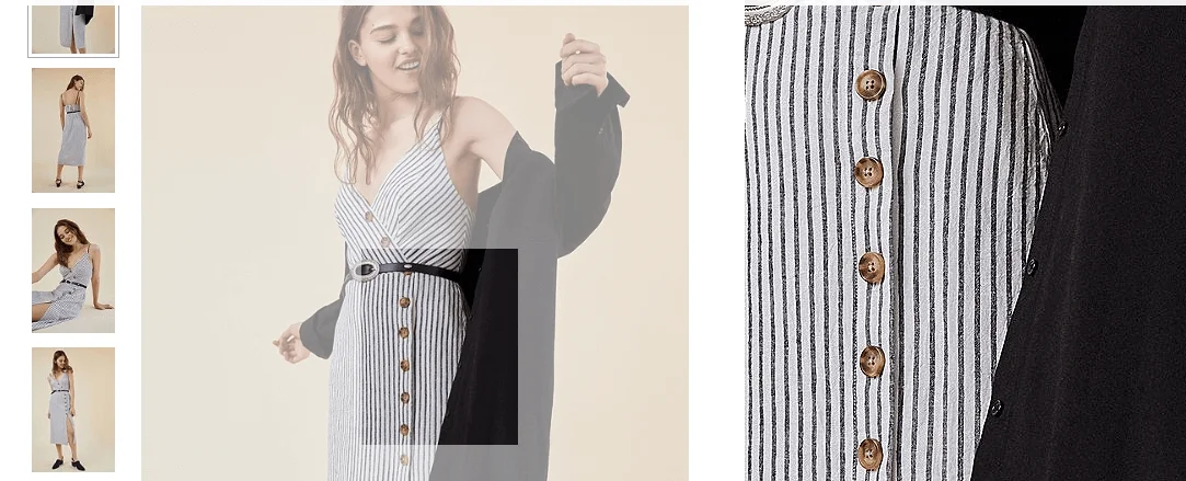
The image above shows a perfect example of the way products should be presented on an ecommerce site.
On the left, there are several different views of the dress.
Users are also able to look at fine details by rolling their cursor over the images and viewing the close-up window to the right.
Also, notice how the dress is shown on a model rather than on a hanger or laying on the floor.
The images are also super high resolution to present the best possible image of the garment.
7. Be honest at all times
In addition to using honest product photos and clear pricing information, you should make your shipping and return policies readily available on your website.
Adding a link to your main navigation menu for store policies is a quick and easy way to take care of this important detail…
…many ecommerce store owners forget about.
A little bit of persuasive language is to be expected, but don’t go overboard and never make an attempt to completely deceive your visitors.
8. Include reviews and/or testimonials
61% of online shoppers report reading customer reviews before deciding to purchase a product.
You can use this helpful statistic to your advantage by including reviews and testimonials right on your website.
Customer reviews are a quick and easy way to quickly promote sales and conversions.
One effective ecommerce web design strategy is to include product-specific reviews directly under each individual product’s description.
If you don’t have very many different products, you can also include an entirely separate page of your site for reviews and testimonials.
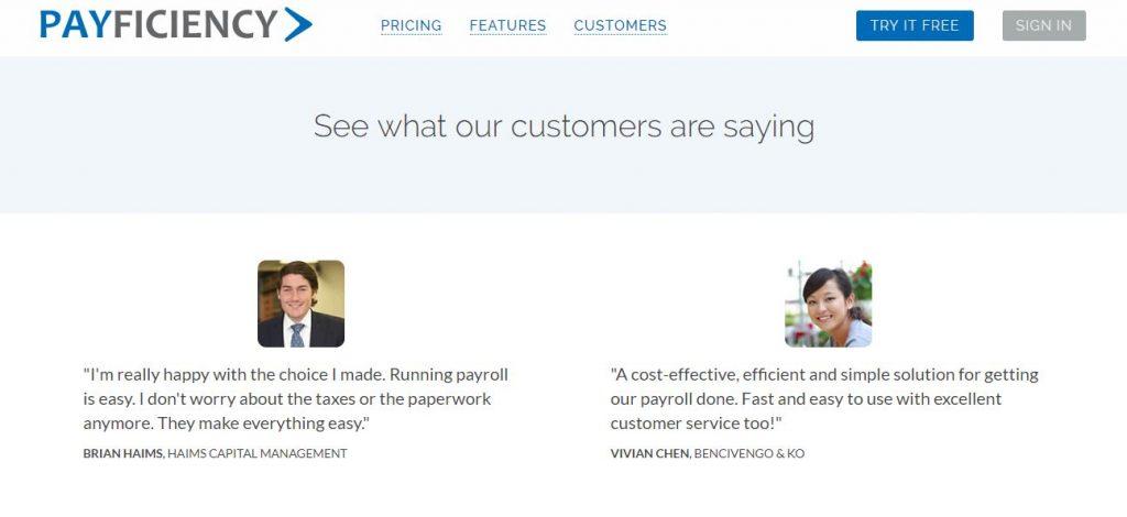
This website features a full page of customer testimonials for prospective customers to read through.
Menu bars allow users to easily navigate the pages of your website to find what they are looking for.
The menu should appear across all pages for maximum ease, preferably across the top of the page.
Sometimes, menu bars are vertical along the left side of the page to still accommodate the F format.
Just be careful not to load up your menu with too many options, as this can appear cluttered and confusing.
If you have a lot of different categories and pages on your website.
You can use a drop-down menu to more easily organize them without causing a sensory overload.

The website in the image above has a lot of different products, so they organized them into just a few categories in their navigation menu.
Then utilize a drop-down menu that pops up when you hover over each category to show more specific types of products.
This is an awesome organizational strategy to avoid overwhelming website visitors.
10. Keep your products organized
To make it as easy as possible for users to find the products they are looking for.
You should keep the products on your site organized into specific categories.
Categories should be easy to find through a menu bar to streamline the search process.
This can also give users a glimpse into product categories they did not even know you had.

This ecommerce store has multiple product categories on their menu bar including accessories, electronics, and more.
Once a user clicks on one of these categories, they can narrow their search with more specific options like electronic type or brand.
This is useful because even if someone clicks onto their website in search of an automobile part.
They may end up purchasing a piece of jewelry or some other product that they did not previously know the website had in stock.
11. Show scarcity
Do you know which products that are often out of stock? Yes, you’re right! These are the brand’s best sellers.
Products with out of stock, limited stocks or sold tags in homepage or category pages are often what users notice more.
Creating scarcity of a product can play tricks with customer’s psychology.
If they fear missing out on a product, it will result in impulse buying thus boosting your sales.
12. Search bar
Many of your website visitors will likely have a specific product already in mind when they enter your website.
Having a search bar allows them to find the product they have in mind easily without having to scroll through pages of information…
…they aren’t interested in.
If a user cannot quickly find a way to search your site for the product they want, they are more likely to go somewhere else for it.
That’s why your search bar should appear near the top of your website, often in the right hand corner, to make it as quick and easy to find as possible.
13. Allow users to filter products
On the subject of search bars, you can improve your ecommerce site’s search features by making filters available.
Nothing is worse than finding the perfect pair of shoes online only to realize the store doesn’t carry your size.
Allowing users to filter your products is the best way to avoid this pitfall. Popular search filters include size, color, brand, and price.
This allows users to search your website for the product they want while also ensuring the results they see are as specific as possible to what they want.
Making the navigation process as seamless as possible.

On the left side of the above webpage, you can see a “filter by” section.
Within the footwear category on the website, you’re able to add additional filters including brands and more.
This webpage is also a great example of some of the other ecommerce web design tactics we mentioned earlier like…
…putting a search bar on the top by the menu bar, a clickable logo on the top-left corner, and a view cart button.
14. Natural flow
You want to make it as easy as possible for visitors on your site to find the products they are looking for and make a purchase.
Keep in mind the natural flow of the eye when designing your ecommerce site.
Studies and heat maps have shown that people tend to view websites in an E or F formation.
Starting at the top-left corner and working their way horizontally across the page, then down the left side, horizontally again, so on and so forth.
This is why navigation menus typically appear horizontally across the top of each page of a website.
Utilize the E formation in your ecommerce web design to guide visitors’ eyes towards main conversion points.

15. Grid layout
Grid style layouts tend to be the best for ecommerce sites, and for most sites in general.
When users are browsing products, it’s best to keep them in organized rows and columns.
Just be careful not to cram too many different products in one row.
We recommend only having three or four products per row to make your product catalog pages visually appealing.
Keeping plenty of white space around each item gives people breathing room and allows them to clearly differentiate between products.

16. Contact info
If a customer has a question or concern while viewing your site, they’re likely going to search for a “contact us” page…
…or scroll down to the bottom of your homepage in search of contact information.
Make your contact information as easy to find as possible.
You don’t want to lose a customer for something as simple as forgetting to put an email address or phone number on your homepage!
It’s best to include as much contact information as possible.
There are plenty of options here such as an email address, a phone number, hours of operation, a contact form that will allow users to directly send…
…an email, or even a widget to let them send a Facebook message to your company directly through the website.

In addition to having a phone number, address, and email address listed at the bottom of our homepage.
The website for our social media management company also includes a “Contact Us” tab with a form for people to contact us directly through email.
17. Quick, simple checkout
Nothing leads to higher cart abandonment rates than a complicated checkout process.
There are a few easy ways to simplify the checkout process on your ecommerce site.
For one, allow users to check out as a guest.
People become suspicious when too much information is required of them to make a purchase.
And, having to create a whole account on your site can turn them away faster than you can say “cart abandonment”.
Request only the information that is absolutely necessary like a shipping address, name, and payment information.
If your product or service is entirely digital, there is no need to even ask for an address as it won’t be being shipped anywhere.
Moreover, be sure to clearly state your payment gateways and the payment options they can choose from such as:
Using credit card, PayPal, bank transfer, and so on.
Are your cart abandonment rates still high?
Don’t worry! Studies show that only about 2% of an ecommerce store’s visitors will make a purchase on their first visit to the site.
A retargeting campaign can convince people to come right back to your site and complete their purchase.
18. Thank you pages
Once someone makes a purchase on your website, they should be redirected to a thank you page.
This page serves a couple of extremely important purposes.
First of all, order confirmation or thank you pages are a necessity to properly track conversions through social media ads.
Secondly, it allows users to be confident their purchase has gone through and lets them know that you appreciate their business.

19. Mobile optimization
A little over 50% of all websites are opened from mobile devices.
And that percentage is only expected to increase as smartphones and tablets become even more advanced.
Failing to optimize your ecommerce web design for mobile use is one of the biggest mistakes you can make!
In fact, Google sees the importance of having mobile-friendly websites so much that it launched an algorithm especially for it- the Mobilegeddon.
Having a responsive design allows your ecommerce website to adapt to any type of screen or operating system.
So you don’t have to worry about making an entirely separate mobile version of your site for every different type of device.
Just make sure your image sizes, CTAs and form fields work on all different platforms.
The bottom line is that when testing your site, always be sure to view it from several different devices and operating systems, just to be sure.

Bonus tip: allowing people to pay for your products using PayPal One Touch or Apple Pay can boost conversions by up to 12%!
20. FAQ page
Tired of answering customer inquiries constantly?
Including an FAQ page on your website’s navigation menu not only alleviates the flow of product questions.
But it can also establish more trust in your website visitors.
How do FAQ pages establish trust? They let your visitors know that you are making an effort to be transparent with your products and/or services.
They also allow people to know you are serious about answering queries and suggest that you have good customer service skills…
…and genuinely care about helping people find the information they need.
Not only that, but having an easily accessible list of answers to common questions about your brand establishes you as an expert.
Building confidence in potential customers that you fully understand your own product.
People are more likely to buy from a company that appears reputable and knowledgeable.
FAQ pages can also improve site navigation with the use of hyperlinks that link out to appropriate pages of your website.
21. Consistent branding
While it is wise to use popular ecommerce web design conventions to optimize your website, you also want your site to stand out from your competitors.
Consistent branding across all pages of your site makes standing out easy!
Make sure your logo is visible on every page of your site and keep color schemes and fonts consistent and on brand.
No one likes clicking onto a page of a website only to wonder if they are on a new website entirely.
Maintaining the same navigation menu and design scheme across all pages displays a consistent and trustworthy image.
You may have noticed that most popular ecommerce stores have buttons that link out to their social media on their website.
Including social icons in your ecommerce web design invites customers to keep in touch and encourages more long-term customer/brand relationships.
Having social media links on your website has also been proven to boost search engine position ranking!
Just make sure the links open your social media accounts in a new tab since you don’t really want people leaving your website.

23. Keep text to a minimum
Odds are, a user came to your website because they were interested in one of your products, not to read a novel (unless you’re selling novels, of course).
The average Internet user has a short attention span, and large blocks of text can be off-putting.
Try to keep all the text on your website, including product descriptions, as brief as possible.
Organizing information into short paragraphs, bullet points.
Or, even infographics can make them much easier to read and increase the likelihood that people will actually read them.
So there you have it! These are the 22 tips for effective e-commerce website design. Need additional help designing your e-commerce site?
We are here to help! Contact us to learn more about our e-commerce marketing services.
Other Ecommerce Resources
- Top 25 Shopify Agencies In The US 2026
- 6 REAL Ecommerce Case Studies (How To Make $250K+)
- Top 25 Ecommerce Tips You’ll Need To Promote Your Online Store
- Product Photography for Ecommerce: Getting it Right
- Having the Best Product Description is Important & Here’s Why
- Ecommerce Email Marketing Tips and Tricks to Increase Your ROI
- 15 Ecommerce Marketing Strategies to Increase Your Online Sales
- 10 Best Ecommerce Marketing Ideas to Boost Your Online Sales
- How to Make Product Images that Sell
- How to Promote Your Amazon Shop

One Response
Thank you for those 22 tips! I am an economic developer about to launch a new organic air freshener & odor neutralizer company. We have engaged a web developer and social media assistant to help launch and I wanted to learn more about the best ways to develop our site. I believe that I found that information here on your site.